9
Bar Graphs
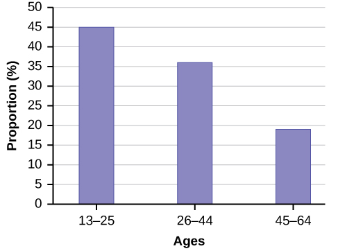
Bar graphs consist of bars that are separated from each other. The bars can be rectangles or they can be rectangular boxes (used in three-dimensional plots), and they can be vertical or horizontal. The bar graph shown in (Figure) has age groups represented on the x-axis and proportions on the y-axis.
By the end of 2011, Facebook had over 146 million users in the United States. (Figure) shows three age groups, the number of users in each age group, and the proportion (%) of users in each age group. Construct a bar graph using this data.
| Age groups | Number of Facebook users | Proportion (%) of Facebook users |
|---|---|---|
| 13–25 | 65,082,280 | 45% |
| 26–44 | 53,300,200 | 36% |
| 45–64 | 27,885,100 | 19% |
The population in Park City is made up of children, working-age adults, and retirees. (Figure) shows the three age groups, the number of people in the town from each age group, and the proportion (%) of people in each age group. Construct a bar graph showing the proportions.
| Age groups | Number of people | Proportion of population |
|---|---|---|
| Children | 67,059 | 19% |
| Working-age adults | 152,198 | 43% |
| Retirees | 131,662 | 38% |
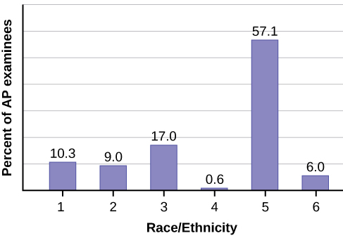
The columns in (Figure) contain: the race or ethnicity of students in U.S. Public Schools for the class of 2011, percentages for the Advanced Placement examine population for that class, and percentages for the overall student population. Create a bar graph with the student race or ethnicity (qualitative data) on the x-axis, and the Advanced Placement examinee population percentages on the y-axis.
| Race/Ethnicity | AP Examinee Population | Overall Student Population |
|---|---|---|
| 1 = Asian, Asian American or Pacific Islander | 10.3% | 5.7% |
| 2 = Black or African American | 9.0% | 14.7% |
| 3 = Hispanic or Latino | 17.0% | 17.6% |
| 4 = American Indian or Alaska Native | 0.6% | 1.1% |
| 5 = White | 57.1% | 59.2% |
| 6 = Not reported/other | 6.0% | 1.7% |
Park city is broken down into six voting districts. The table shows the percent of the total registered voter population that lives in each district as well as the percent total of the entire population that lives in each district. Construct a bar graph that shows the registered voter population by district.
| District | Registered voter population | Overall city population |
|---|---|---|
| 1 | 15.5% | 19.4% |
| 2 | 12.2% | 15.6% |
| 3 | 9.8% | 9.0% |
| 4 | 17.4% | 18.5% |
| 5 | 22.8% | 20.7% |
| 6 | 22.3% | 16.8% |
Histograms
For most of the work you do in this book, you will use a histogram to display the data. One advantage of a histogram is that it can readily display large data sets. A rule of thumb is to use a histogram when the data set consists of 100 values or more.
A histogram consists of contiguous (adjoining) boxes. It has both a horizontal axis and a vertical axis. The horizontal axis is labeled with what the data represents (for instance, distance from your home to school). The vertical axis is labeled either frequency or relative frequency (or percent frequency or probability). The graph will have the same shape with either label. The histogram (like the stemplot) can give you the shape of the data, the center, and the spread of the data.
The relative frequency is equal to the frequency for an observed value of the data divided by the total number of data values in the sample. (Remember, frequency is defined as the number of times an answer occurs.) If:
- f = frequency
- n = total number of data values (or the sum of the individual frequencies), and
- RF = relative frequency,
then:
For example, if three students in Mr. Ahab’s English class of 40 students received from 90% to 100%, then,
f = 3, n = 40, and RF = \(\frac{f}{n}\) = \(\frac{3}{40}\) = 0.075. 7.5% of the students received 90–100%. 90–100% are quantitative measures.
To construct a histogram, first decide how many bars or intervals, also called classes, represent the data. Many histograms consist of five to 15 bars or classes for clarity. The number of bars needs to be chosen. Choose a starting point for the first interval to be less than the smallest data value. A convenient starting point is a lower value carried out to one more decimal place than the value with the most decimal places. For example, if the value with the most decimal places is 6.1 and this is the smallest value, a convenient starting point is 6.05 (6.1 – 0.05 = 6.05). We say that 6.05 has more precision. If the value with the most decimal places is 2.23 and the lowest value is 1.5, a convenient starting point is 1.495 (1.5 – 0.005 = 1.495). If the value with the most decimal places is 3.234 and the lowest value is 1.0, a convenient starting point is 0.9995 (1.0 – 0.0005 = 0.9995). If all the data happen to be integers and the smallest value is two, then a convenient starting point is 1.5 (2 – 0.5 = 1.5). Also, when the starting point and other boundaries are carried to one additional decimal place, no data value will fall on a boundary. The next two examples go into detail about how to construct a histogram using continuous data and how to create a histogram using discrete data.
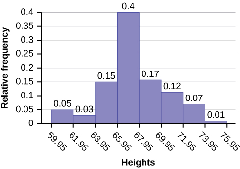
The following data are the heights (in inches to the nearest half inch) of 100 male semiprofessional soccer players. The heights are continuous data, since height is measured.
60; 60.5; 61; 61; 61.5
63.5; 63.5; 63.5
64; 64; 64; 64; 64; 64; 64; 64.5; 64.5; 64.5; 64.5; 64.5; 64.5; 64.5; 64.5
66; 66; 66; 66; 66; 66; 66; 66; 66; 66; 66.5; 66.5; 66.5; 66.5; 66.5; 66.5; 66.5; 66.5; 66.5; 66.5; 66.5; 67; 67; 67; 67; 67; 67; 67; 67; 67; 67; 67; 67; 67.5; 67.5; 67.5; 67.5; 67.5; 67.5; 67.5
68; 68; 69; 69; 69; 69; 69; 69; 69; 69; 69; 69; 69.5; 69.5; 69.5; 69.5; 69.5
70; 70; 70; 70; 70; 70; 70.5; 70.5; 70.5; 71; 71; 71
72; 72; 72; 72.5; 72.5; 73; 73.5
74
The smallest data value is 60. Since the data with the most decimal places has one decimal (for instance, 61.5), we want our starting point to have two decimal places. Since the numbers 0.5, 0.05, 0.005, etc. are convenient numbers, use 0.05 and subtract it from 60, the smallest value, for the convenient starting point.
60 – 0.05 = 59.95 which is more precise than, say, 61.5 by one decimal place. The starting point is, then, 59.95.
The largest value is 74, so 74 + 0.05 = 74.05 is the ending value.
Next, calculate the width of each bar or class interval. To calculate this width, subtract the starting point from the ending value and divide by the number of bars (you must choose the number of bars you desire). Suppose you choose eight bars.
We will round up to two and make each bar or class interval two units wide. Rounding up to two is one way to prevent a value from falling on a boundary. Rounding to the next number is often necessary even if it goes against the standard rules of rounding. For this example, using 1.76 as the width would also work. A guideline that is followed by some for the number of bars or class intervals is to take the square root of the number of data values and then round to the nearest whole number, if necessary. For example, if there are 150 values of data, take the square root of 150 and round to 12 bars or intervals.
The boundaries are:
- 59.95
- 59.95 + 2 = 61.95
- 61.95 + 2 = 63.95
- 63.95 + 2 = 65.95
- 65.95 + 2 = 67.95
- 67.95 + 2 = 69.95
- 69.95 + 2 = 71.95
- 71.95 + 2 = 73.95
- 73.95 + 2 = 75.95
The heights 60 through 61.5 inches are in the interval 59.95–61.95. The heights that are 63.5 are in the interval 61.95–63.95. The heights that are 64 through 64.5 are in the interval 63.95–65.95. The heights 66 through 67.5 are in the interval 65.95–67.95. The heights 68 through 69.5 are in the interval 67.95–69.95. The heights 70 through 71 are in the interval 69.95–71.95. The heights 72 through 73.5 are in the interval 71.95–73.95. The height 74 is in the interval 73.95–75.95.
The following histogram displays the heights on the x-axis and relative frequency on the y-axis.
The following data are the shoe sizes of 50 male students. The sizes are discrete data since shoe size is measured in whole and half units only. Construct a histogram and calculate the width of each bar or class interval. Suppose you choose six bars.
9; 9; 9.5; 9.5; 10; 10; 10; 10; 10; 10; 10.5; 10.5; 10.5; 10.5; 10.5; 10.5; 10.5; 10.5
11; 11; 11; 11; 11; 11; 11; 11; 11; 11; 11; 11; 11; 11.5; 11.5; 11.5; 11.5; 11.5; 11.5; 11.5
12; 12; 12; 12; 12; 12; 12; 12.5; 12.5; 12.5; 12.5; 14
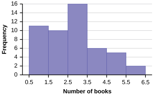
Create a histogram for the following data: the number of books bought by 50 part-time college students at ABC College.the number of books bought by 50 part-time college students at ABC College. The number of books is discrete data, since books are counted.
1; 1; 1; 1; 1; 1; 1; 1; 1; 1; 1
2; 2; 2; 2; 2; 2; 2; 2; 2; 2
3; 3; 3; 3; 3; 3; 3; 3; 3; 3; 3; 3; 3; 3; 3; 3
4; 4; 4; 4; 4; 4
5; 5; 5; 5; 5
6; 6
Eleven students buy one book. Ten students buy two books. Sixteen students buy three books. Six students buy four books. Five students buy five books. Two students buy six books.
Because the data are integers, subtract 0.5 from 1, the smallest data value and add 0.5 to 6, the largest data value. Then the starting point is 0.5 and the ending value is 6.5.
Next, calculate the width of each bar or class interval. If the data are discrete and there are not too many different values, a width that places the data values in the middle of the bar or class interval is the most convenient. Since the data consist of the numbers 1, 2, 3, 4, 5, 6, and the starting point is 0.5, a width of one places the 1 in the middle of the interval from 0.5 to 1.5, the 2 in the middle of the interval from 1.5 to 2.5, the 3 in the middle of the interval from 2.5 to 3.5, the 4 in the middle of the interval from _______ to _______, the 5 in the middle of the interval from _______ to _______, and the _______ in the middle of the interval from _______ to _______ .
- 3.5 to 4.5
- 4.5 to 5.5
- 6
- 5.5 to 6.5
Calculate the number of bars as follows:
where 1 is the width of a bar. Therefore, bars = 6.
The following histogram displays the number of books on the x-axis and the frequency on the y-axis.
Go to (Figure). There are calculator instructions for entering data and for creating a customized histogram. Create the histogram for (Figure).
- Press Y=. Press CLEAR to delete any equations.
- Press STAT 1:EDIT. If L1 has data in it, arrow up into the name L1, press CLEAR and then arrow down. If necessary, do the same for L2.
- Into L1, enter 1, 2, 3, 4, 5, 6.
- Into L2, enter 11, 10, 16, 6, 5, 2.
- Press WINDOW. Set Xmin = .5, Xmax = 6.5, Xscl = (6.5 – .5)/6, Ymin = –1, Ymax = 20, Yscl = 1, Xres = 1.
- Press 2nd Y=. Start by pressing 4:Plotsoff ENTER.
- Press 2nd Y=. Press 1:Plot1. Press ENTER. Arrow down to TYPE. Arrow to the 3rd picture (histogram). Press ENTER.
- Arrow down to Xlist: Enter L1 (2nd 1). Arrow down to Freq. Enter L2 (2nd 2).
- Press GRAPH.
- Use the TRACE key and the arrow keys to examine the histogram.
The following data are the number of sports played by 50 student athletes. The number of sports is discrete data since sports are counted.
1; 1; 1; 1; 1; 1; 1; 1; 1; 1; 1; 1; 1; 1; 1; 1; 1; 1; 1; 1
2; 2; 2; 2; 2; 2; 2; 2; 2; 2; 2; 2; 2; 2; 2; 2; 2; 2; 2; 2; 2; 2
3; 3; 3; 3; 3; 3; 3; 3
20 student athletes play one sport. 22 student athletes play two sports. Eight student athletes play three sports.
Fill in the blanks for the following sentence. Since the data consist of the numbers 1, 2, 3, and the starting point is 0.5, a width of one places the 1 in the middle of the interval 0.5 to _____, the 2 in the middle of the interval from _____ to _____, and the 3 in the middle of the interval from _____ to _____.
Using this data set, construct a histogram.
| Number of Hours My Classmates Spent Playing Video Games on Weekends | ||||
|---|---|---|---|---|
| 9.95 | 10 | 2.25 | 16.75 | 0 |
| 19.5 | 22.5 | 7.5 | 15 | 12.75 |
| 5.5 | 11 | 10 | 20.75 | 17.5 |
| 23 | 21.9 | 24 | 23.75 | 18 |
| 20 | 15 | 22.9 | 18.8 | 20.5 |
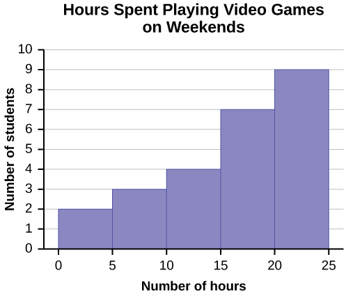
Some values in this data set fall on boundaries for the class intervals. A value is counted in a class interval if it falls on the left boundary, but not if it falls on the right boundary. Different researchers may set up histograms for the same data in different ways. There is more than one correct way to set up a histogram.
The following data represent the number of employees at various restaurants in New York City. Using this data, create a histogram.
22 35 15 26 40 28 18 20 25 34 39 42 24 22 19 27 22 34 40 20 38 and 28
Use 10–19 as the first interval.
Count the money (bills and change) in your pocket or purse. Your instructor will record the amounts. As a class, construct a histogram displaying the data. Discuss how many intervals you think is appropriate. You may want to experiment with the number of intervals.
Stem and Leaf
One simple graph, the stem-and-leaf graph or stemplot, comes from the field of exploratory data analysis. It is a good choice when the data sets are small. To create the plot, divide each observation of data into a stem and a leaf. The leaf consists of a final significant digit. For example, 23 has stem two and leaf three. The number 432 has stem 43 and leaf two. Likewise, the number 5,432 has stem 543 and leaf two. The decimal 9.3 has stem nine and leaf three. Write the stems in a vertical line from smallest to largest. Draw a vertical line to the right of the stems. Then write the leaves in increasing order next to their corresponding stem.
For Susan Dean’s spring pre-calculus class, scores for the first exam were as follows (smallest to largest):
33; 42; 49; 49; 53; 55; 55; 61; 63; 67; 68; 68; 69; 69; 72; 73; 74; 78; 80; 83; 88; 88; 88; 90; 92; 94; 94; 94; 94; 96; 100
| Stem | Leaf |
|---|---|
| 3 | 3 |
| 4 | 2 9 9 |
| 5 | 3 5 5 |
| 6 | 1 3 7 8 8 9 9 |
| 7 | 2 3 4 8 |
| 8 | 0 3 8 8 8 |
| 9 | 0 2 4 4 4 4 6 |
| 10 | 0 |
The stemplot shows that most scores fell in the 60s, 70s, 80s, and 90s. Eight out of the 31 scores or approximately 26% (left(frac{8}{31}right)) were in the 90s or 100, a fairly high number of As.
For the Park City basketball team, scores for the last 30 games were as follows (smallest to largest):
32; 32; 33; 34; 38; 40; 42; 42; 43; 44; 46; 47; 47; 48; 48; 48; 49; 50; 50; 51; 52; 52; 52; 53; 54; 56; 57; 57; 60; 61
Construct a stem plot for the data.
The stemplot is a quick way to graph data and gives an exact picture of the data. You want to look for an overall pattern and any outliers. An outlier is an observation of data that does not fit the rest of the data. It is sometimes called an extreme value. When you graph an outlier, it will appear not to fit the pattern of the graph. Some outliers are due to mistakes (for example, writing down 50 instead of 500) while others may indicate that something unusual is happening. It takes some background information to explain outliers, so we will cover them in more detail later.
The data are the distances (in kilometers) from a home to local supermarkets. Create a stemplot using the data:
1.1; 1.5; 2.3; 2.5; 2.7; 3.2; 3.3; 3.3; 3.5; 3.8; 4.0; 4.2; 4.5; 4.5; 4.7; 4.8; 5.5; 5.6; 6.5; 6.7; 12.3
Do the data seem to have any concentration of values?
The leaves are to the right of the decimal.
The value 12.3 may be an outlier. Values appear to concentrate at three and four kilometers.
| Stem | Leaf |
|---|---|
| 1 | 1 5 |
| 2 | 3 5 7 |
| 3 | 2 3 3 5 8 |
| 4 | 0 2 5 5 7 8 |
| 5 | 5 6 |
| 6 | 5 7 |
| 7 | |
| 8 | |
| 9 | |
| 10 | |
| 11 | |
| 12 | 3 |
The following data show the distances (in miles) from the homes of off-campus statistics students to the college. Create a stem plot using the data and identify any outliers:
0.5; 0.7; 1.1; 1.2; 1.2; 1.3; 1.3; 1.5; 1.5; 1.7; 1.7; 1.8; 1.9; 2.0; 2.2; 2.5; 2.6; 2.8; 2.8; 2.8; 3.5; 3.8; 4.4; 4.8; 4.9; 5.2; 5.5; 5.7; 5.8; 8.0
A side-by-side stem-and-leaf plot allows a comparison of the two data sets in two columns. In a side-by-side stem-and-leaf plot, two sets of leaves share the same stem. The leaves are to the left and the right of the stems. (Figure) and (Figure) show the ages of presidents at their inauguration and at their death. Construct a side-by-side stem-and-leaf plot using this data.
| Ages at Inauguration | Ages at Death | |
|---|---|---|
| 9 9 8 7 7 7 6 3 2 | 4 | 6 9 |
| 8 7 7 7 7 6 6 6 5 5 5 5 4 4 4 4 4 2 2 1 1 1 1 1 0 | 5 | 3 6 6 7 7 8 |
| 9 8 5 4 4 2 1 1 1 0 | 6 | 0 0 3 3 4 4 5 6 7 7 7 8 |
| 7 | 0 0 1 1 1 4 7 8 8 9 | |
| 8 | 0 1 3 5 8 | |
| 9 | 0 0 3 3 |
| President | Age | President | Age | President | Age |
|---|---|---|---|---|---|
| Washington | 57 | Lincoln | 52 | Hoover | 54 |
| J. Adams | 61 | A. Johnson | 56 | F. Roosevelt | 51 |
| Jefferson | 57 | Grant | 46 | Truman | 60 |
| Madison | 57 | Hayes | 54 | Eisenhower | 62 |
| Monroe | 58 | Garfield | 49 | Kennedy | 43 |
| J. Q. Adams | 57 | Arthur | 51 | L. Johnson | 55 |
| Jackson | 61 | Cleveland | 47 | Nixon | 56 |
| Van Buren | 54 | B. Harrison | 55 | Ford | 61 |
| W. H. Harrison | 68 | Cleveland | 55 | Carter | 52 |
| Tyler | 51 | McKinley | 54 | Reagan | 69 |
| Polk | 49 | T. Roosevelt | 42 | G.H.W. Bush | 64 |
| Taylor | 64 | Taft | 51 | Clinton | 47 |
| Fillmore | 50 | Wilson | 56 | G. W. Bush | 54 |
| Pierce | 48 | Harding | 55 | Obama | 47 |
| Buchanan | 65 | Coolidge | 51 |
| President | Age | President | Age | President | Age |
|---|---|---|---|---|---|
| Washington | 67 | Lincoln | 56 | Hoover | 90 |
| J. Adams | 90 | A. Johnson | 66 | F. Roosevelt | 63 |
| Jefferson | 83 | Grant | 63 | Truman | 88 |
| Madison | 85 | Hayes | 70 | Eisenhower | 78 |
| Monroe | 73 | Garfield | 49 | Kennedy | 46 |
| J. Q. Adams | 80 | Arthur | 56 | L. Johnson | 64 |
| Jackson | 78 | Cleveland | 71 | Nixon | 81 |
| Van Buren | 79 | B. Harrison | 67 | Ford | 93 |
| W. H. Harrison | 68 | Cleveland | 71 | Reagan | 93 |
| Tyler | 71 | McKinley | 58 | ||
| Polk | 53 | T. Roosevelt | 60 | ||
| Taylor | 65 | Taft | 72 | ||
| Fillmore | 74 | Wilson | 67 | ||
| Pierce | 64 | Harding | 57 | ||
| Buchanan | 77 | Coolidge | 60 |
The table shows the number of wins and losses the Atlanta Hawks have had in 42 seasons. Create a side-by-side stem-and-leaf plot of these wins and losses.
| Losses | Wins | Year | Losses | Wins | Year |
|---|---|---|---|---|---|
| 34 | 48 | 1968–1969 | 41 | 41 | 1989–1990 |
| 34 | 48 | 1969–1970 | 39 | 43 | 1990–1991 |
| 46 | 36 | 1970–1971 | 44 | 38 | 1991–1992 |
| 46 | 36 | 1971–1972 | 39 | 43 | 1992–1993 |
| 36 | 46 | 1972–1973 | 25 | 57 | 1993–1994 |
| 47 | 35 | 1973–1974 | 40 | 42 | 1994–1995 |
| 51 | 31 | 1974–1975 | 36 | 46 | 1995–1996 |
| 53 | 29 | 1975–1976 | 26 | 56 | 1996–1997 |
| 51 | 31 | 1976–1977 | 32 | 50 | 1997–1998 |
| 41 | 41 | 1977–1978 | 19 | 31 | 1998–1999 |
| 36 | 46 | 1978–1979 | 54 | 28 | 1999–2000 |
| 32 | 50 | 1979–1980 | 57 | 25 | 2000–2001 |
| 51 | 31 | 1980–1981 | 49 | 33 | 2001–2002 |
| 40 | 42 | 1981–1982 | 47 | 35 | 2002–2003 |
| 39 | 43 | 1982–1983 | 54 | 28 | 2003–2004 |
| 42 | 40 | 1983–1984 | 69 | 13 | 2004–2005 |
| 48 | 34 | 1984–1985 | 56 | 26 | 2005–2006 |
| 32 | 50 | 1985–1986 | 52 | 30 | 2006–2007 |
| 25 | 57 | 1986–1987 | 45 | 37 | 2007–2008 |
| 32 | 50 | 1987–1988 | 35 | 47 | 2008–2009 |
| 30 | 52 | 1988–1989 | 29 | 53 | 2009–2010 |
References
Burbary, Ken. Facebook Demographics Revisited – 2001 Statistics, 2011. Available online at http://www.kenburbary.com/2011/03/facebook-demographics-revisited-2011-statistics-2/ (accessed August 21, 2013).
“9th Annual AP Report to the Nation.” CollegeBoard, 2013. Available online at http://apreport.collegeboard.org/goals-and-findings/promoting-equity (accessed September 13, 2013).
“Overweight and Obesity: Adult Obesity Facts.” Centers for Disease Control and Prevention. Available online at http://www.cdc.gov/obesity/data/adult.html (accessed September 13, 2013).
Chapter Review
A bar graph is a chart that uses either horizontal or vertical bars to show comparisons among categories. One axis of the chart shows the specific categories being compared, and the other axis represents a discrete value. Some bar graphs present bars clustered in groups of more than one (grouped bar graphs), and others show the bars divided into subparts to show cumulative effect (stacked bar graphs). Bar graphs are especially useful when categorical data is being used. A histogram is a graphic version of a frequency distribution. The graph consists of bars of equal width drawn adjacent to each other. The horizontal scale represents classes of quantitative data values and the vertical scale represents frequencies. The heights of the bars correspond to frequency values. Histograms are typically used for large, continuous, quantitative data sets. A stem-and-leaf plot is a way to plot data and look at the distribution. In a stem-and-leaf plot, all data values within a class are visible. The advantage in a stem-and-leaf plot is that all values are listed, unlike a histogram, which gives classes of data values.
For each of the following data sets, create a stem plot and identify any outliers.The miles per gallon rating for 30 cars are shown below (lowest to highest).
19, 19, 19, 20, 21, 21, 25, 25, 25, 26, 26, 28, 29, 31, 31, 32, 32, 33, 34, 35, 36, 37, 37, 38, 38, 38, 38, 41, 43, 43
| Stem | Leaf |
|---|---|
| 1 | 9 9 9 |
| 2 | 0 1 1 5 5 5 6 6 8 9 |
| 3 | 1 1 2 2 3 4 5 6 7 7 8 8 8 8 |
| 4 | 1 3 3 |
The height in feet of 25 trees is shown below (lowest to highest).
25, 27, 33, 34, 34, 34, 35, 37, 37, 38, 39, 39, 39, 40, 41, 45, 46, 47, 49, 50, 50, 53, 53, 54, 54
The data are the prices of different laptops at an electronics store. Round each value to the nearest ten.
249, 249, 260, 265, 265, 280, 299, 299, 309, 319, 325, 326, 350, 350, 350, 365, 369, 389, 409, 459, 489, 559, 569, 570, 610
| Stem | Leaf |
|---|---|
| 2 | 5 5 6 7 7 8 |
| 3 | 0 0 1 2 3 3 5 5 5 7 7 9 |
| 4 | 1 6 9 |
| 5 | 6 7 7 |
| 6 | 1 |
The data are daily high temperatures in a town for one month.
61, 61, 62, 64, 66, 67, 67, 67, 68, 69, 70, 70, 70, 71, 71, 72, 74, 74, 74, 75, 75, 75, 76, 76, 77, 78, 78, 79, 79, 95
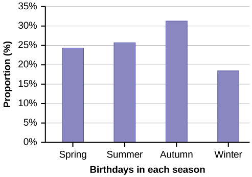
| Seasons | Number of students | Proportion of population |
|---|---|---|
| Spring | 8 | 24% |
| Summer | 9 | 26% |
| Autumn | 11 | 32% |
| Winter | 6 | 18% |
Using the data from Mrs. Ramirez’s math class supplied in (Figure), construct a bar graph showing the percentages.
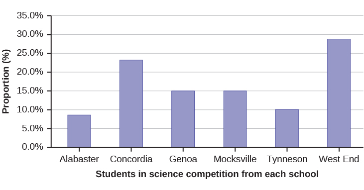
David County has six high schools. Each school sent students to participate in a county-wide science competition. (Figure) shows the percentage breakdown of competitors from each school, and the percentage of the entire student population of the county that goes to each school. Construct a bar graph that shows the population percentage of competitors from each school.
| High School | Science competition population | Overall student population |
|---|---|---|
| Alabaster | 28.9% | 8.6% |
| Concordia | 7.6% | 23.2% |
| Genoa | 12.1% | 15.0% |
| Mocksville | 18.5% | 14.3% |
| Tynneson | 24.2% | 10.1% |
| West End | 8.7% | 28.8% |
Use the data from the David County science competition supplied in (Figure). Construct a bar graph that shows the county-wide population percentage of students at each school.
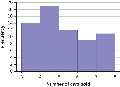
Sixty-five randomly selected car salespersons were asked the number of cars they generally sell in one week. Fourteen people answered that they generally sell three cars; nineteen generally sell four cars; twelve generally sell five cars; nine generally sell six cars; eleven generally sell seven cars. Complete the table.
| Data Value (# cars) | Frequency | Relative Frequency | Cumulative Relative Frequency |
|---|---|---|---|
What does the frequency column in (Figure) sum to? Why?
65
What does the relative frequency column in (Figure) sum to? Why?
What is the difference between relative frequency and frequency for each data value in (Figure)?
The relative frequency shows the proportion of data points that have each value. The frequency tells the number of data points that have each value.
What is the difference between cumulative relative frequency and relative frequency for each data value?
To construct the histogram for the data in (Figure), determine the appropriate minimum and maximum x and y values and the scaling. Sketch the histogram. Label the horizontal and vertical axes with words. Include numerical scaling.
Answers will vary. One possible histogram is shown:
Homework
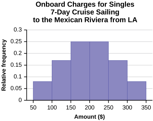
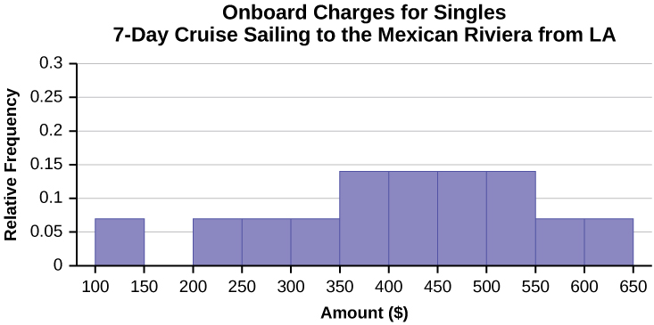
1) Often, cruise ships conduct all on-board transactions, with the exception of gambling, on a cashless basis. At the end of the cruise, guests pay one bill that covers all onboard transactions. Suppose that 60 single travelers and 70 couples were surveyed as to their on-board bills for a seven-day cruise from Los Angeles to the Mexican Riviera. Following is a summary of the bills for each group.
| Amount(\$) | Frequency | Rel. Frequency |
|---|---|---|
| 51–100 | 5 | |
| 101–150 | 10 | |
| 151–200 | 15 | |
| 201–250 | 15 | |
| 251–300 | 10 | |
| 301–350 | 5 |
| Amount(\$) | Frequency | Rel. Frequency |
|---|---|---|
| 100–150 | 5 | |
| 201–250 | 5 | |
| 251–300 | 5 | |
| 301–350 | 5 | |
| 351–400 | 10 | |
| 401–450 | 10 | |
| 451–500 | 10 | |
| 501–550 | 10 | |
| 551–600 | 5 | |
| 601–650 | 5 |
- Fill in the relative frequency for each group.
- Construct a histogram for the singles group. Scale the x-axis by \$50 widths. Use relative frequency on the y-axis.
- Construct a histogram for the couples group. Scale the x-axis by \$50 widths. Use relative frequency on the y-axis.
- Compare the two graphs:
- List two similarities between the graphs.
- List two differences between the graphs.
- Overall, are the graphs more similar or different?
- Construct a new graph for the couples by hand. Since each couple is paying for two individuals, instead of scaling the x-axis by \$50, scale it by \$100. Use relative frequency on the y-axis.
- Compare the graph for the singles with the new graph for the couples:
- List two similarities between the graphs.
- Overall, are the graphs more similar or different?
- How did scaling the couples graph differently change the way you compared it to the singles graph?
- Based on the graphs, do you think that individuals spend the same amount, more or less, as singles as they do person by person as a couple? Explain why in one or two complete sentences.
2) Suppose that three book publishers were interested in the number of fiction paperbacks adult consumers purchase per month. Each publisher conducted a survey. In the survey, adult consumers were asked the number of fiction paperbacks they had purchased the previous month. The results are as follows:
| # of books | Freq. | Rel. Freq. |
|---|---|---|
| 0 | 10 | |
| 1 | 12 | |
| 2 | 16 | |
| 3 | 12 | |
| 4 | 8 | |
| 5 | 6 | |
| 6 | 2 | |
| 8 | 2 |
| # of books | Freq. | Rel. Freq. |
|---|---|---|
| 0 | 18 | |
| 1 | 24 | |
| 2 | 24 | |
| 3 | 22 | |
| 4 | 15 | |
| 5 | 10 | |
| 7 | 5 | |
| 9 | 1 |
| # of books | Freq. | Rel. Freq. |
|---|---|---|
| 0–1 | 20 | |
| 2–3 | 35 | |
| 4–5 | 12 | |
| 6–7 | 2 | |
| 8–9 | 1 |
- Find the relative frequencies for each survey. Write them in the charts.
- Using either a graphing calculator, computer, or by hand, use the frequency column to construct a histogram for each publisher’s survey. For Publishers A and B, make bar widths of one. For Publisher C, make bar widths of two.
- In complete sentences, give two reasons why the graphs for Publishers A and B are not identical.
- Would you have expected the graph for Publisher C to look like the other two graphs? Why or why not?
- Make new histograms for Publisher A and Publisher B. This time, make bar widths of two.
- Now, compare the graph for Publisher C to the new graphs for Publishers A and B. Are the graphs more similar or more different? Explain your answer.
3) Use the following information to answer the next two exercises: Suppose one hundred eleven people who shopped in a special t-shirt store were asked the number of t-shirts they own costing more than \$19 each.
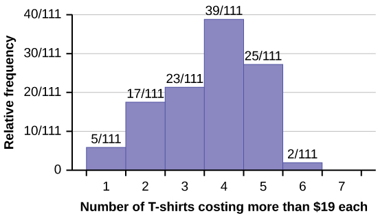
The percentage of people who own at most three t-shirts costing more than \$19 each is approximately:
- 21
- 59
- 41
- Cannot be determined
4) If the data were collected by asking the first 111 people who entered the store, then the type of sampling is:
- cluster
- simple random
- stratified
- convenience
5) Following are the 2010 obesity rates by U.S. states and Washington, DC.
| State | Percent (%) | State | Percent (%) | State | Percent (%) |
|---|---|---|---|---|---|
| Alabama | 32.2 | Kentucky | 31.3 | North Dakota | 27.2 |
| Alaska | 24.5 | Louisiana | 31.0 | Ohio | 29.2 |
| Arizona | 24.3 | Maine | 26.8 | Oklahoma | 30.4 |
| Arkansas | 30.1 | Maryland | 27.1 | Oregon | 26.8 |
| California | 24.0 | Massachusetts | 23.0 | Pennsylvania | 28.6 |
| Colorado | 21.0 | Michigan | 30.9 | Rhode Island | 25.5 |
| Connecticut | 22.5 | Minnesota | 24.8 | South Carolina | 31.5 |
| Delaware | 28.0 | Mississippi | 34.0 | South Dakota | 27.3 |
| Washington, DC | 22.2 | Missouri | 30.5 | Tennessee | 30.8 |
| Florida | 26.6 | Montana | 23.0 | Texas | 31.0 |
| Georgia | 29.6 | Nebraska | 26.9 | Utah | 22.5 |
| Hawaii | 22.7 | Nevada | 22.4 | Vermont | 23.2 |
| Idaho | 26.5 | New Hampshire | 25.0 | Virginia | 26.0 |
| Illinois | 28.2 | New Jersey | 23.8 | Washington | 25.5 |
| Indiana | 29.6 | New Mexico | 25.1 | West Virginia | 32.5 |
| Iowa | 28.4 | New York | 23.9 | Wisconsin | 26.3 |
| Kansas | 29.4 | North Carolina | 27.8 | Wyoming | 25.1 |
Construct a bar graph of obesity rates of your state and the four states closest to your state. Hint: Label the x-axis with the states.
6) Student grades on a chemistry exam were: 77, 78, 76, 81, 86, 51, 79, 82, 84, 99
- Construct a stem-and-leaf plot of the data.
- Are there any potential outliers? If so, which scores are they? Why do you consider them outliers?
Answers to odd questions
1)
| Amount(\$) | Frequency | Relative Frequency |
|---|---|---|
| 51–100 | 5 | 0.08 |
| 101–150 | 10 | 0.17 |
| 151–200 | 15 | 0.25 |
| 201–250 | 15 | 0.25 |
| 251–300 | 10 | 0.17 |
| 301–350 | 5 | 0.08 |
| Amount(\$) | Frequency | Relative Frequency |
|---|---|---|
| 100–150 | 5 | 0.07 |
| 201–250 | 5 | 0.07 |
| 251–300 | 5 | 0.07 |
| 301–350 | 5 | 0.07 |
| 351–400 | 10 | 0.14 |
| 401–450 | 10 | 0.14 |
| 451–500 | 10 | 0.14 |
| 501–550 | 10 | 0.14 |
| 551–600 | 5 | 0.07 |
| 601–650 | 5 | 0.07 |
- See (Figure) and (Figure).
- In the following histogram data values that fall on the right boundary are counted in the class interval, while values that fall on the left boundary are not counted (with the exception of the first interval where both boundary values are included).
- In the following histogram, the data values that fall on the right boundary are counted in the class interval, while values that fall on the left boundary are not counted (with the exception of the first interval where values on both boundaries are included).
- Compare the two graphs:
- Answers may vary. Possible answers include:
- Both graphs have a single peak.
- Both graphs use class intervals with width equal to ?50.
- Answers may vary. Possible answers include:
- The couples graph has a class interval with no values.
- It takes almost twice as many class intervals to display the data for couples.
- Answers may vary. Possible answers include: The graphs are more similar than different because the overall patterns for the graphs are the same.
- Answers may vary. Possible answers include:
- Check student’s solution.
- Compare the graph for the Singles with the new graph for the Couples:
-
- Both graphs have a single peak.
- Both graphs display 6 class intervals.
- Both graphs show the same general pattern.
- Answers may vary. Possible answers include: Although the width of the class intervals for couples is double that of the class intervals for singles, the graphs are more similar than they are different.
-
- Answers may vary. Possible answers include: You are able to compare the graphs interval by interval. It is easier to compare the overall patterns with the new scale on the Couples graph. Because a couple represents two individuals, the new scale leads to a more accurate comparison.
- Answers may vary. Possible answers include: Based on the histograms, it seems that spending does not vary much from singles to individuals who are part of a couple. The overall patterns are the same. The range of spending for couples is approximately double the range for individuals.
3) c
5) Answers will vary.
