3.3: Correlation Coefficient
Introduction
So far we have visualized relationships between two quantitative variables using scatterplots, and described the overall pattern of a relationship by considering its direction, form, and strength. We noted that assessing the strength of a relationship just by looking at the scatterplot is quite difficult, and therefore we need to supplement the scatterplot with some kind of numerical measure that will help us assess the strength.
In this part, we will restrict our attention to the special case of relationships that have a linear form, since they are quite common and relatively simple to detect. More importantly, there exists a numerical measure that assesses the strength of the linear relationship between two quantitative variables with which we can supplement the scatterplot. We will introduce this numerical measure here and discuss it in detail.
Even though from this point on we are going to focus only on linear relationships, it is important to remember that not every relationship between two quantitative variables has a linear form. We have actually seen several examples of relationships that are not linear. The statistical tools that will be introduced here are appropriate only for examining linear relationships, and as we will see, when they are used in nonlinear situations, these tools can lead to errors in reasoning.
Let’s start with a motivating example. Consider the following two scatterplots.

We can see that in both cases, the direction of the relationship is positive and the form of the relationship is linear. What about the strength? Recall that the strength of a relationship is the extent to which the data follow its form.
Did I get this?
The purpose of this example was to illustrate how assessing the strength of the linear relationship from a scatterplot alone is problematic, since our judgment might be affected by the scale on which the values are plotted. This example, therefore, provides a motivation for the need to supplement the scatterplot with a numerical measure that will measure the strength of the linear relationship between two quantitative variables.
The Correlation Coefficient—r
The numerical measure that assesses the strength of a linear relationship is called the correlation coefficient and is denoted by r. We will
- Define the correlation r.
- Discuss the calculation of r.
- Explain how to interpret the value of r.
- Talk about some of the properties of r.
Definition: The correlation coefficient (r) is a numerical measure that measures the strength and direction of a linear relationship between two quantitative variables.
Calculation: r is calculated using the following formula: [latex]\mathcal{r}=\frac{1}{\mathcal{n}1}\sum_{\mathcal{i}=1}^{\mathcal{n}}\left(\frac{\mathcal{x}_\mathcal{i}-\bar{\mathcal{x}}}{\mathcal{S}_\mathcal{x}}\right)\left(\frac{\mathcal{y}_\mathcal{i}-\bar{\mathcal{y}}}{\mathcal{S}_\mathcal{x}}\right)[/latex]
However, the calculation of the correlation (r) is not the focus of this course. We will use a statistics package to calculate r for us, and the emphasis of this course is on the interpretation of its value.
Interpretation
Once we obtain the value of r, its interpretation with respect to the strength of linear relationships is quite simple, as this walkthrough illustrates:
To get a better sense of how the value of r relates to the strength of the linear relationship, take a look at the activity below.
The slider bar at the top of the HTML activity allows us to vary the value of the correlation coefficient (r) between −1 and 1 in order to observe the effect on a scatterplot. Click the Switch Sign button to change the sign of the correlation (positive or negative) while keeping the value the same.
Now that we understand the use of r as a numerical measure for assessing the direction and strength of linear relationships between quantitative variables, we will look at a few examples.
Example
Highway Sign Visibility
Earlier, we used the scatterplot below to find a negative linear relationship between the age of a driver and the maximum distance at which a highway sign was legible. What about the strength of the relationship? It turns out that the correlation between the two variables is r = -0.793.

Since r < 0, it confirms that the direction of the relationship is negative (although we really didn’t need r to tell us that). Since r is relatively close to -1, it suggests that the relationship is moderately strong. In context, the negative correlation confirms that the maximum distance at which a sign is legible generally decreases with age. Since the value of r indicates that the linear relationship is moderately strong, but not perfect, we can expect the maximum distance to vary somewhat, even among drivers of the same age.
Statistics Courses
A statistics department is interested in tracking the progress of its students from entry until graduation. As part of the study, the department tabulates the performance of 10 students in an introductory course and in an upper-level course required for graduation. What is the relationship between the students’ course averages in the two courses? Here is the scatterplot for the data:

The scatterplot suggests a relationship that is positive in direction, linear in form, and seems quite strong. The value of the correlation that we find between the two variables is r = 0.931, which is very close to 1, and thus confirms that indeed the linear relationship is very strong.
Comment
Note that in both examples we supplemented the scatterplot with the correlation (r). Now that we have the correlation (r), why do we still need to look at a scatterplot when examining the relationship between two quantitative variables?
The correlation coefficient can only be interpreted as the measure of the strength of a linear relationship, so we need the scatterplot to verify that the relationship indeed looks linear. This point and its importance will be clearer after we examine a few properties of r.
Did I get this?


Properties of r
We now discuss and illustrate several important properties of the correlation coefficient as a numerical measure of the strength of a linear relationship.
-
The correlation does not change when the units of measurement of either one of the variables change. In other words, if we change the units of measurement of the explanatory variable and/or the response variable, the change has no effect on the correlation (r).
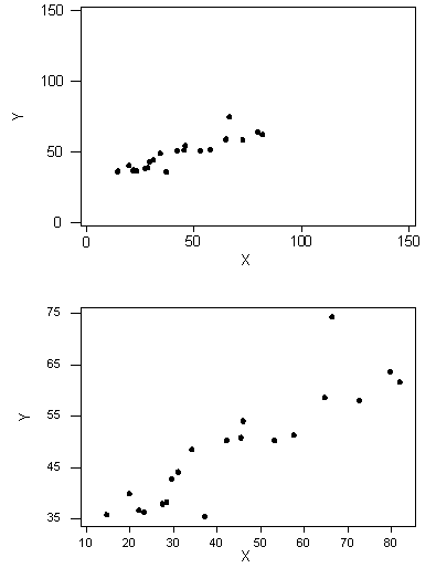
To illustrate, following are two versions of the scatterplot of the relationship between sign legibility distance and driver’s age:

The top scatterplot displays the original data where the maximum distances is measured in feet. The bottom scatterplot displays the same relationship but with maximum distances changed to meters. Notice that the Y-values have changed, but the correlations are the same. This example illustrates haw changing the units of measurement of the response variable has no effect on r, but as we indicated above, the same is true for changing the units of the explanatory variable, or of both variables.
This might be a good place to comment that the correlation (r) is unitless. It is just a number.
-
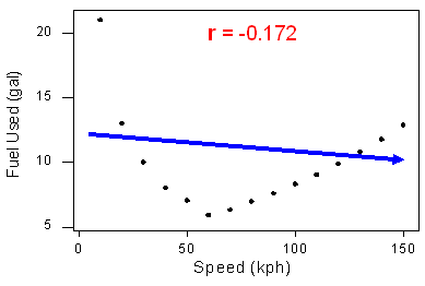
The correlation measures only the strength of a linear relationship between two variables. It ignores any other type of relationship, no matter how strong it is. For example, consider the relationship between the average fuel usage of driving a fixed distance in a car, and the speed at which the car drives:

Our data describe a fairly simple curvilinear relationship: the amount of fuel consumed decreases rapidly to a minimum for a car driving 60 kilometers per hour, and then increases gradually for speeds exceeding 60 kilometers per hour. The relationship is very strong, as the observations seem to perfectly fit the curve.
Although the relationship is strong, the correlation r = -0.172 indicates a weak linear relationship. This makes sense considering that the data fails to adhere closely to a linear form:

The correlation is useless for assessing the strength of any type of relationship that is not linear (including relationships that are curvilinear, such as the one in our example). Beware, then, of interpreting the fact that r is close to 0 as an indicator of a weak relationship rather than a weak linear relationship. This example also illustrates how important it is to always look at the data in the scatterplot because, as in our example, there might be a strong nonlinear relationship that r does not indicate.
Since the correlation was nearly zero when the form of the relationship was not linear, we might ask if the correlation can be used to determine whether or not a relationship is linear.
-
The correlation by itself is not sufficient to determine whether a relationship is linear. To see this, let’s consider the study that examined the effect of monetary incentives on the return rate of questionnaires. Below is the scatterplot relating the percentage of participants who completed a survey to the monetary incentive that researchers promised to participants, in which we find a trong curvilinear relationship:

The relationship is curvilinear, yet the correlation r = 0.876 is quite close to 1.
In the last two examples, we have seen two very strong curvilinear relationships, one with a correlation close to 0 and one with a correlation close to 1. Therefore, the correlation alone does not indicate whether a relationship is linear. The important principle here is:
Always look at the data!
-
The correlation is heavily influenced by outliers. As you will learn in the next two activities, the way in which the outlier influences the correlation depends on whether the outlier is consistent with the pattern of the linear relationship.
Using the applet below, we explore how an outlier affects the correlation.
To see how an outlier affects the correlation, do the following:
-
Fill the scatterplot with a hypothetical positive linear relationship between X and Y (by clicking on the graph about a dozen times starting at lower left and going up diagonally to the top right). Pay attention to the correlation coefficient calculated at the top right of the applet. (Clicking on the garbage can will let you start over.)
-
Once you are satisfied with your hypothetical data, create an outlier by clicking on one of the data points in the upper right of the graph, and dragging it down along the right side of the graph. Again, pay attention to what happens to the value of the correlation.
-
Hopefully, you’ve noticed the correlation decreasing when you created this kind of outlier, which is not consistent with the pattern of the relationship.

