3.2: Scatterplots
Scatterplot
In the previous two cases we had a categorical explanatory variable, and therefore exploring the relationship between the two variables was done by comparing the distribution of the response variable for each category of the explanatory variable:
- In case C→Q we compared distributions of the quantitative response.
- In case C→C we compared distributions of the categorical response.
Case Q→Q is different in the sense that both variables (in particular the explanatory variable) are quantitative, and therefore, as you’ll discover, this case will require a different kind of treatment and tools. Let’s start with an example:
Example
Highway Signs
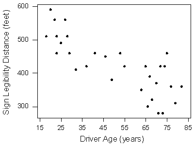
A Pennsylvania research firm conducted a study in which 30 drivers (of ages 18 to 82 years old) were sampled, and for each one, the maximum distance (in feet) at which he/she could read a newly designed sign was determined. The goal of this study was to explore the relationship between a driver’s age and the maximum distance at which signs were legible, and then use the study’s findings to improve safety for older drivers. (Reference: Utts and Heckard, Mind on Statistics (2002). Originally source: Data collected by Last Resource, Inc, Bellfonte, PA.)
Since the purpose of this study is to explore the effect of age on maximum legibility distance,
- the explanatory variable is Age, and
- the response variable is Distance.
Here is what the raw data look like:

Note that the data structure is such that for each individual (in this case driver 1….driver 30) we have a pair of values (in this case representing the driver’s age and distance). We can therefore think about these data as 30 pairs of values: (18, 510), (32, 410), (55, 420), … , (82, 360).
The first step in exploring the relationship between driver age and sign legibility distance is to create an appropriate and informative graphical display. The appropriate graphical display for examining the relationship between two quantitative variables is the scatterplot. Here is how a scatterplot is constructed for our example:
To create a scatterplot, each pair of values is plotted, so that the value of the explanatory variable (X) is plotted on the horizontal axis, and the value of the response variable (Y) is plotted on the vertical axis. In other words, each individual (driver, in our example) appears on the scatterplot as a single point whose X-coordinate is the value of the explanatory variable for that individual, and whose Y-coordinate is the value of the response variable. Here is an illustration:

And here is the completed scatterplot:
Comment
It is important to mention again that when creating a scatterplot, the explanatory variable should always be plotted on the horizontal X-axis, and the response variable should be plotted on the vertical Y-axis. If in a specific example we do not have a clear distinction between explanatory and response variables, each of the variables can be plotted on either axis.
Interpreting the scatterplot
How do we explore the relationship between two quantitative variables using the scatterplot? What should we look at, or pay attention to?
Recall that when we described the distribution of a single quantitative variable with a histogram, we described the overall pattern of the distribution (shape, center, spread) and any deviations from that pattern (outliers). We do the same thing with the scatterplot. The following figure summarizes this point:

As the figure explains, when describing the overall pattern of the relationship we look at its direction, form and strength.
-
The direction of the relationship can be positive, negative, or neither:


A positive (or increasing) relationship means that an increase in one of the variables is associated with an increase in the other.
A negative (or decreasing) relationship means that an increase in one of the variables is associated with a decrease in the other.
Not all relationships can be classified as either positive or negative.
-
The form of the relationship is its general shape. When identifying the form, we try to find the simplest way to describe the shape of the scatterplot. There are many possible forms. Here are a couple that are quite common:
Relationships with a linear form are most simply described as points scattered about a line:

Relationships with a curvilinear form are most simply described as points dispersed around the same curved line:

There are many other possible forms for the relationship between two quantitative variables, but linear and curvilinear forms are quite common and easy to identify. Another form-related pattern that we should be aware of is clusters in the data:

-
The strength of the relationship is determined by how closely the data follow the form of the relationship. Let’s look, for example, at the following two scatterplots displaying positive, linear relationships:


The strength of the relationship is determined by how closely the data points follow the form. We can see that in the top scatterplot the data points follow the linear pattern quite closely. This is an example of a strong relationship. In the bottom scatterplot, the points also follow the linear pattern, but much less closely, and therefore we can say that the relationship is weaker. In general, though, assessing the strength of a relationship just by looking at the scatterplot is quite problematic, and we need a numerical measure to help us with that. We will discuss that later in this section.
Data points that deviate from the pattern of the relationship are called outliers. We will see several examples of outliers during this section. Two outliers are illustrated in the scatterplot below:

Let’s go back now to our example, and use the scatterplot to examine the relationship between the age of the driver and the maximum sign legibility distance. Here is the scatterplot:

The direction of the relationship is negative, which makes sense in context, since as you get older your eyesight weakens, and in particular older drivers tend to be able to read signs only at lesser distances. An arrow drawn over the scatterplot illustrates the negative direction of this relationship:

The form of the relationship seems to be linear. Notice how the points tend to be scattered about the line. Although, as we mentioned earlier, it is problematic to assess the strength without a numerical measure, the relationship appears to be moderately strong, as the data is fairly tightly scattered about the line. Finally, all the data points seem to “obey” the pattern—there do not appear to be any outliers.
We will now look at two more examples:
Example
Average Gestation Period
The average gestation period, or time of pregnancy, of an animal is closely related to its longevity (the length of its lifespan.) Data on the average gestation period and longevity (in captivity) of 40 different species of animals have been examined, with the purpose of examining how the gestation period of an animal is related to (or can be predicted from) its longevity. (Source: Rossman and Chance. (2001). Workshop statistics: Discovery with data and Minitab. Original source: The 1993 world almanac and book of facts).
Here is the scatterplot of the data.

What can we learn about the relationship from the scatterplot? The direction of the relationship is positive, which means that animals with longer life spans tend to have longer times of pregnancy (this makes intuitive sense). An arrow drawn over the scatterplot below illustrates this:

The form of the relationship is again essentially linear. There appears to be one outlier, indicating an animal with an exceptionally long longevity and gestation period. (This animal happens to be the elephant.) Note that while this outlier definitely deviates from the rest of the data in term of its magnitude, it does follow the direction of the data.
Comment: Another feature of the scatterplot that is worth observing is how the variation in gestation increases as longevity increases. This fact is illustrated by the two red vertical lines at the bottom left part of the graph. Note that the gestation periods for animals who live 5 years range from about 30 days up to about 120 days. On the other hand, the gestation period of animals who live 12 years varies much more, and ranges from about 60 days up to more than 400 days.
Example
Fuel Usage
As a third example, consider the relationship between the average amount of fuel used (in liters) to drive a fixed distance in a car (100 kilometers), and the speed at which the car is driven (in kilometers per hour). (Source: Moore and McCabe, (2003). Introduction to the practice of statistics. Original source: T.N. Lam. (1985). “Estimating fuel consumption for engine size,” Journal of Transportation Engineering, vol. 111)
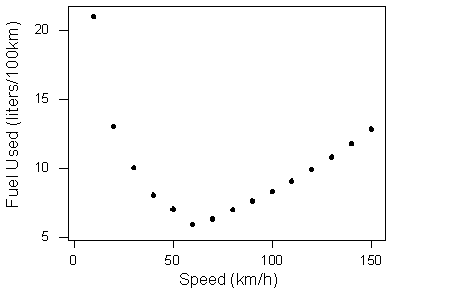
The data describe a relationship that decreases and then increases—the amount of fuel consumed decreases rapidly to a minimum for a car driving 60 kilometers per hour, and then increases gradually for speeds exceeding 60 kilometers per hour. This suggests that the speed at which a car economizes on fuel the most is about 60 km/h. This forms a curvilinear relationship that seems to be very strong, as the observations seem to perfectly fit the curve. Finally, there do not appear to be any outliers.
Did I get this?
A study examined how the percentage of participants who completed a survey is related to the monetary incentive that researchers promised to participants. Consider the relationship between these two quantitative variables, displayed in the scatterplot below.

Comment
The example in the last activity provides a great opportunity for interpretation of the form of the relationship in context. Recall that the example examined how the percentage of participants who completed a survey is affected by the monetary incentive that researchers promised to participants. Here again is the scatterplot that displays the relationship:
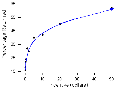
The positive relationship definitely makes sense in context, but what is the interpretation of the curvilinear form in the context of the problem? How can we explain (in context) the fact that the relationship seems at first to be increasing very rapidly, but then slows down? The following graph will help us:

Note that when the monetary incentive increases from $0 to $10, the percentage of returned surveys increases sharply—an increase of 27% (from 16% to 43%). However, the same increase of $10 from $30 to $40 doesn’t result in the same dramatic increase in the percentage of returned surveys—it results in an increase of only 3% (from 54% to 57%). The form displays the phenomenon of “diminishing returns”—a return rate that after a certain point fails to increase proportionately to additional outlays of investment. $10 is worth more to people relative to $0 than it is relative to $30.
A Labeled Scatterplot
In certain circumstances, it may be reasonable to indicate different subgroups or categories within the data on the scatterplot, by labeling each subgroup differently. The result is called a labeled scatterplot, and can provide further insight about the relationship we are exploring. here is an example.
Example
Hot Dogs
Recall the hot dog example from case C→Q, in which 54 major hot dog brands were examined. In this study, both the calorie content and the sodium level of each brand was recorded, as well as the type of hot dog: beef, poultry, and meat (mostly pork and beef, but up to 15% poultry meat). In this example we will explore the relationship between the sodium level and calorie content of hot dogs, and we will label the three different types of hot dogs to create a labeled scatterplot.
Creating a Labeled Scatterplot
The scatterplot below displays the relationship between the sodium and calorie content of 54 brands of hot dogs. Note that in this example there is no clear explanatory-response distinction, and we decided to have sodium content as the explanatory variable, and calorie content as the response variable.
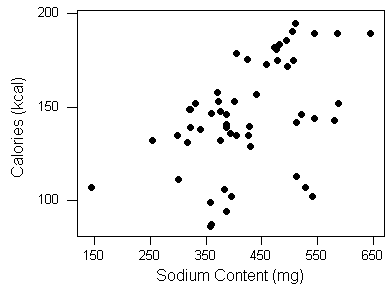
The scatterplot displays a positive relationship, which means that hot dogs containing more sodium tend to be higher in calories.

The form of the relationship, however, is kind of hard to determine. Maybe if we label the scatterplot, indicating the type of hot dogs, we will get a better understanding of the form.
Here is the labeled scatterplot, with the three different colors representing the three types of hot dogs, as indicated.

The display does give us more insight about the form of the relationship between sodium and calorie content.

It appears that there is a positive relationship within all three types. In other words, we can generally expect hot dogs that are higher in sodium to be higher in calories, no matter what type of hot dog we consider. In addition, we can see that hot dogs made of poultry (indicated in blue) are generally lower in calories. This is a result we have seen before.
Interestingly, it appears that the form of the relationship specifically for poultry is further clustered, and
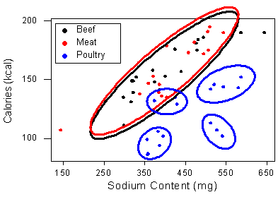
we can only speculate about whether there is another categorical variable that describes these apparent sub-categories of poultry hot dogs.
Let’s Summarize
- The relationship between two quantitative variables is visually displayed using the scatterplot, where each point represents an individual. We always plot the explanatory variable on the horizontal X-axis and the response variable on the vertical Y-axis.
- When we explore a relationship using the scatterplot we should describe the overall pattern of the relationship and any deviations from that pattern. To describe the overall pattern consider the direction, form and strength of the relationship. Assessing the strength just by looking at the scatterplot can be problematic; using a numerical measure to determine strength will be discussed later in this course.
- Adding labels to the scatterplot that indicate different groups or categories within the data might help us get more insight about the relationship we are exploring.

