2.1: Organizing and Visualizing Data
As indicated in the introduction, we will begin the Exploratory Data Analysis part of the course by exploring (or looking at) one variable at a time.
As we saw in Data Types and Levels of Measurement, the data for each variable are a long list of values (whether numerical or not), and are not very informative in that form. In order to convert these raw data into useful information we need to summarize and then examine the distribution of the variable. By distribution of a variable, we mean:
- what values the variable takes, and
- how often the variable takes those values.
This chapter has two sections. We will first learn how to summarize and examine the distribution of a single categorical variable, and then do the same for a quantitative variable.
Organizing One Categorical Variable
What is your perception of your own body? Do you feel that you are overweight, underweight, or about right?
A random sample of 1,200 U.S. college students were asked this question as part of a larger survey. The following table shows part of the responses:
| Body Image | ||||||||||||
|---|---|---|---|---|---|---|---|---|---|---|---|---|
|
Here is some information that would be interesting to get from these data:
-
What percentage of the sampled students fall into each category?
-
How are students divided across the three body image categories? Are they equally divided? If not, do the percentages follow some other kind of pattern?
There is no way that we can answer these questions by looking at the raw data, which are in the form of a long list of 1,200 responses, and thus not very useful. However, both these questions will be easily answered once we summarize and look at the distribution of the variable Body Image (i.e., once we summarize how often each of the categories occurs).
In order to summarize the distribution of a categorical variable, we first create a table of the different values (categories) the variable takes, how many times each value occurs (count) and, more importantly, how often each value occurs (by converting the counts to percentages); this table is called a frequency distribution. Here is the frequency distribution for our example:
| Body Image Distribution | |||||||||||||||
|---|---|---|---|---|---|---|---|---|---|---|---|---|---|---|---|
|
In order to visualize the numerical summaries we’ve obtained, we need a graphical display. There are two simple graphical displays for visualizing the distribution of categorical data:
-
The Pie Chart

- The Bar Chart

Did I get this?
Now that we have summarized the distribution of values in the Body Image variable, let’s go back and interpret the results in the context of the questions that we posed:
Now that we’ve interpreted the results, there are some other interesting questions that arise:
-
Can we reliably generalize our results to the entire population of interest and conclude that a similar distribution across body image categories exists among all U.S. college students? In particular, can we make such a generalization even though our sample consisted of only 1,200 students, which is a very small fraction of the entire population?
-
If we had separated our sample by gender and looked at males and females separately, would we have found a similar distribution across body image categories?
These are the types of questions that we will deal with in future sections of the course.
Comments
-
While both the pie chart and the bar chart help us visualize the distribution of a categorical variable, the pie chart emphasizes how the different categories relate to the whole, and the bar chart emphasizes how the different categories compare with each other.
-
A variation on the pie chart and bar chart that is very commonly used in the media is the pictogram. Here are two examples:

Source: USA Today Snapshots and the Impulse Research for Northern Confidential Bathroom survey

Source: Market Facts for the Association of Dressings and Sauces
-
Beware: Pictograms can be misleading. Consider the following pictogram:

This graph is aimed at advertisers deciding where to spend their budgets, and clearly suggests that Time magazine attracts by far the largest amount of advertising spending. Are the differences really as dramatic as the graph suggests? If we look carefully at the numbers above the pens, we find that advertisers spend in Time only $4,433,879 / $2,698,386 = 1.64 times more than in Newsweek, and only $4,433,879 / $1,537,617 = 2.88 times more than in U.S. News. By looking at the pictogram, however, we get the impression that Time is much further ahead. Why? In order to magnify the picture without distorting it, we must increase both its height and width. As a result, the area of Time’s pen is 1.64 * 1.64 = 2.7 times larger than the Newsweek pen, and 2.88 * 2.88 = 8.3 times larger than the U.S. News pen. Our eyes capture the area of the pens rather than only the height, and so we are misled to think that Time is a bigger winner than it really is.
Let’s Summarize
-
The distribution of a categorical variable is summarized using:
-
Graphical display: pie chart or bar chart, supplemented by
-
Numerical summaries: category counts and percentages.
-
-
A variation on pie charts and bar charts is the pictogram.
-
Pictograms can be misleading, so make sure to use a critical approach when interpreting the information the pictogram is trying to convey.
Organizing One Quantitative Variable
In the previous section, we explored the distribution of a categorical variable using graphs (pie chart, bar chart) supplemented by numerical measures (percent of observations in each category). In this section, we will explore the data collected from a quantitative variable, and learn how to describe and summarize the important features of its distribution. We will first learn how to display the distribution using graphs and then move on to discuss numerical measures.
To display data from one quantitative variable graphically, we can use either the histogram or the stem plot. (Another graph, the boxplot, will be mentioned later).
Idea
Break the range of values into intervals and count how many observations fall into each interval.
Example
Exam Grades
Here are the exam grades of 15 students:
| 88, 48, 60, 51, 57, 85, 69, 75, 97, 72, 71, 79, 65, 63, 73 |
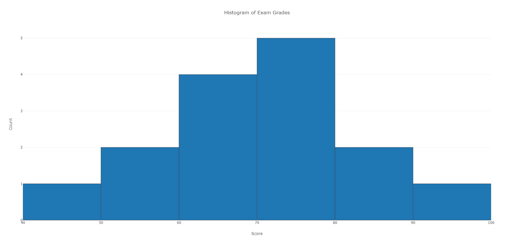
We first need to break the range of values into intervals (also called “bins” or “classes”). In this case, since our dataset consists of exam scores, it will make sense to choose intervals that typically correspond to the range of a letter grade, 10 points wide: 40–50, 50–60, … 90–100. By counting how many of the 15 observations fall in each of the intervals, we get the following table:
| Exam Grades | ||||||||||||||
|---|---|---|---|---|---|---|---|---|---|---|---|---|---|---|
|
Note: The observation 60 was counted in the 60–70 interval. See comment 1 below.
To construct the histogram from this table we plot the intervals on the X-axis, and show the number of observations in each interval (frequency of the interval) on the Y-axis, which is represented by the height of a rectangle located above the interval:

The table above can also be turned into a relative frequency table using the following steps:
- Add a row on the bottom and include the total number of observations in the dataset that are represented in the table.
- Add a column, at the end of the table, and calculate the relative frequency for each interval, by dividing the number of observations in each row by the total number of observations.
These two steps are illustrated in red in the following frequency distribution table:

It is also possible to determine the number of scores for an interval, if you have the total number of observations and the relative frequency for that interval. For instance, suppose there are 15 scores (or observations) in a set of data and the relative frequency for an interval is .13. To determine the number of scores in that interval, multiplying the total number of observations by the relative frequency and round up to the next whole number: 15*.13 = 1.95, which rounds up to 2 observations.
A relative frequency table, like the one above, can be used to determine the frequency of scores occurring at or across intervals. Here are some examples, using the above frequency table:
- What is the percentage of exam scores that were 70 and up to, but not including, 80?
- To determine the answer, we look at the relative frequency associated with the [70-80) interval. The relative frequency is .33; to convert to percentage, multiply by 100 (.33*100= 33) or 33%.
- What is the percentage of exam scores that are at least 70? To determine the answer, we need to:
- Add together the relative frequencies for the intervals that have scores of at least 70 or above. Thus, would need to add together the relative frequencies from [70-80), [80-90), and [90-100] = .33+.13+.07 = .53.
- To get the percentage, need to multiple the calculated relative frequency by 100. In this case, it would be .53*100 = 53 or 53%.
Learn by Doing
Here is the table from above, use it to answer the question.
| Exam Grades | ||||||||||||||
|---|---|---|---|---|---|---|---|---|---|---|---|---|---|---|
|
Many students wonder…
Question: How do I know what interval width to choose?
Answer: There are no right or wrong choices of interval widths. In this course, we will rely on a statistical package to produce the histogram for us, and we will focus instead on describing and summarizing the distribution as it appears from the histogram.
Did I get this?
An instructor asked her students how much time (to the nearest hour) they spent studying for the midterm. The data are displayed in the following histogram:

Did I get this?
Thirty-two students were asked the number of servings of fruits and vegetables they eat daily. The results are displayed in the histogram below.

Did I get this?
A survey was conducted to see how many phone calls people made daily. The results are displayed in the table below:

Interpreting the Histogram
Once the distribution has been displayed graphically, we can describe the overall pattern of the distribution and mention any striking deviations from that pattern. More specifically, we should consider the following features of the distribution:

We will get a sense of the overall pattern of the data from the histogram’s center, spread and shape, while outliers will highlight deviations from that pattern.
Distribution Shapes
When describing the shape of a distribution, we should consider:
-
Symmetry/skewness of the distribution.
-
Peakedness (modality)—the number of peaks (modes) the distribution has.
We distinguish between:
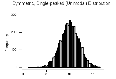
Symmetric Distributions


Note that all three distributions are symmetric, but are different in their modality (peakedness). The first distribution is unimodal—it has one mode (roughly at 10) around which the observations are concentrated. The second distribution is bimodal—it has two modes (roughly at 10 and 20) around which the observations are concentrated. The third distribution is kind of flat, or uniform. The distribution has no modes, or no value around which the observations are concentrated. Rather, we see that the observations are roughly uniformly distributed among the different values.
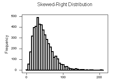
Skewed Right Distributions

A distribution is called skewed right if, as in the histogram above, the right tail (larger values) is much longer than the left tail (small values). Note that in a skewed right distribution, the bulk of the observations are small/medium, with a few observations that are much larger than the rest. An example of a real-life variable that has a skewed right distribution is salary. Most people earn in the low/medium range of salaries, with a few exceptions (CEOs, professional athletes etc.) that are distributed along a large range (long “tail”) of higher values.
Skewed Left Distributions

A distribution is called skewed left if, as in the histogram above, the left tail (smaller values) is much longer than the right tail (larger values). Note that in a skewed left distribution, the bulk of the observations are medium/large, with a few observations that are much smaller than the rest. An example of a real life variable that has a skewed left distribution is age of death from natural causes (heart disease, cancer etc.). Most such deaths happen at older ages, with fewer cases happening at younger ages.
Comments
-
Note that skewed distributions can also be bimodal. Here is an example. A medium size neighborhood 24-hour convenience store collected data from 537 customers on the amount of money spend in a single visit to the store. The following histogram displays the data.

Note that the overall shape of the distribution is skewed to the right with a clear mode around $25. In addition it has another (smaller) “peak” (mode) around $50-55. The majority of the customers spend around $25 but there is a cluster of customers who enter the store and spend around $50-55.
-
If a distribution has more than two modes, we say that the distribution is multimodal.
Recall our grades example:

As you can see from the histogram, the grades distribution is roughly symmetric.
Center
The center of the distribution is its midpoint—the value that divides the distribution so that approximately half the observations take smaller values, and approximately half the observations take larger values. Note that from looking at the histogram we can get only a rough estimate for the center of the distribution. (More exact ways of finding measures of center will be discussed in the next section.)
Recall our grades example:

As you can see from the histogram, the center of the grades distribution is roughly 70 (7 students scored below 70, and 8 students scored above 70).
Spread
The spread (also called variability) of the distribution can be described by the approximate range covered by the data. From looking at the histogram, we can approximate the smallest observation (min), and the largest observation (max), and thus approximate the range. (More exact ways of finding measures of spread are discussed in the next section.)
In our example:
|
Outliers
Outliers are observations that fall outside the overall pattern. For example, the following histogram represents a distribution that has a high probable outlier:

Go back and check the histogram of scores at the top of this page. As you can see, there are no outliers.
Example
Best Actress Oscar Winners
To provide an example of a histogram applied to actual data, we will look at the ages of Best Actress Oscar winners from 1970 to 2013 (To see the full dataset, Dataset_ Best Actress Oscar Winners (1970–2013).)
Review the histogram for the data.
We will now summarize the main features of the distribution of ages as it appears from the histogram:
Shape: The distribution of ages is skewed right. We have a concentration of data among the younger ages and a long tail to the right. The vast majority of the “best actress” awards are given to young actresses, with very few awards given to actresses who are older.
Center: The data seem to be centered around 34 or 35 years old. Note that this implies that roughly half the awards are given to actresses who are less than 34 years old.
Spread: The data range from about 20 to about 80, so the approximate range equals 80 – 20 = 60.
Outliers: There seem to be two probable outliers to the far right and possibly three around 62 years old.
You can see how informative it is to know “what to look at” in a histogram. If there is one conclusion that we can make here, it is that Hollywood likes to give Oscars to young actresses.
Did I get this?
Let’s Summarize
-
The histogram is a graphical display of the distribution of a quantitative variable. It plots the number (count) of observations that fall in intervals of values.
-
When examining the distribution of a quantitative variable, one should describe the overall pattern of the data (shape, center, spread), and any deviations from the pattern (outliers).
-
When describing the shape of a distribution, one should consider:
-
Symmetry/skewness of the distribution
-
Peakedness (modality)—the number of peaks (modes) the distribution has.
*Not all distributions have a simple, recognizable shape.
-
-
Outliers are data points that fall outside the overall pattern of the distribution and need further research before continuing the analysis.
-
It is always important to interpret what the features of the distribution (as they appear in the histogram) mean in the context of the data.
Stemplot
The stem plot (also called stem and leaf plot) is another graphical display of the distribution of quantitative data.
Idea
Separate each data point into a stem and leaf, as follows:
|
Example
Best Actress Oscar Winners
We will continue with the Best Actress Oscar winners example (To see the full dataset, Dataset_ Best Actress Oscar Winners (1970–2013).)
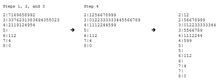
34 34 27 37 42 41 36 32 41 33 31 74 33 49 38 61 21 41 26 80 42 29 33 36 45 49 39 34 26 25 33 35 35 28 30 29 61 32 33 45 29 62 22 44
To make a stem plot:
-
Separate each observation into a stem and a leaf.
-
Write the stems in a vertical column with the smallest at the top, and draw a vertical line at the right of this column.
-
Go through the data points, and write each leaf in the row to the right of its stem.
-
Rearrange the leaves in an increasing order.

* When some of the stems hold a large number of leaves, we can split each stem into two: one holding the leaves 0-4, and the other holding the leaves 5-9. A statistical software package will often do the splitting for you, when appropriate.
Note that when rotated 90 degrees counterclockwise, the stem plot visually resembles a histogram:

This orientation makes the right-skewedness of the distribution clearly visible.
The stem plot has additional unique features:
-
It preserves the original data.
-
It sorts the data (which will become very useful in the next section).
Comment
There is another type of display that we can use to summarize a quantitative variable graphically—the dot plot. The dot plot, like the stem plot, shows each observation, but displays it with a dot rather than with its actual value. Here is the dot plot for the ages of Best Actress Oscar winners.

Let’s Summarize
The stem plot is a simple but useful visual display of quantitative data. Its principal virtues are:
-
Easy and quick to construct for small, simple datasets.
-
Retains the actual data.
-
Sorts (ranks) the data.
Many students wonder…
Question: How do we know which graph to use: the histogram, stemplot, or dotplot?
Answer: Since for the most part we are not going to deal with very small data sets in this course, we will generally display the distribution of a quantitative variable using a histogram generated by a statistical software package.

