2.3 Map Projections
Paul Webb
It’s impossible to study oceanography without looking at maps, so it is important to recognize the strengths and weaknesses of the types of maps you might encounter. It is difficult to accurately represent a three-dimensional spherical object like the Earth on a flat, two-dimensional map or chart. Therefore, two-dimensional maps are distorted in representing the Earth’s true area, direction, distance, and shape. Only a globe is accurate in all of these variables, but globes are impractical to use in the field, and impossible to reproduce in a book. Because of these limitations, we use different map projections to represent the Earth, depending on the needs of the presenter. Below are some of the more common map projections used in oceanography.
In a Mercator projection, latitude and longitude are both represented as straight, parallel lines intersecting at right angles (Figure 2.3.1). This projection is good for navigation as directions are preserved; for example, on any point on the map, north points to the top of the chart. This makes Mercator projections the standard for navigational charts. The drawback to this projection is that size and distance are distorted at high latitudes. This is because the distance between lines of longitude declines as you approach the poles, but they remain constant on a Mercator projection. The poles, which are represented by a point on a globe, are expanded to have the same circumference as the equator. This exaggerates distances, and thus area, at high latitudes. For example, South America is really nine times larger than Greenland, but on a Mercator map they appear to be the same size (Figure 2.3.1).

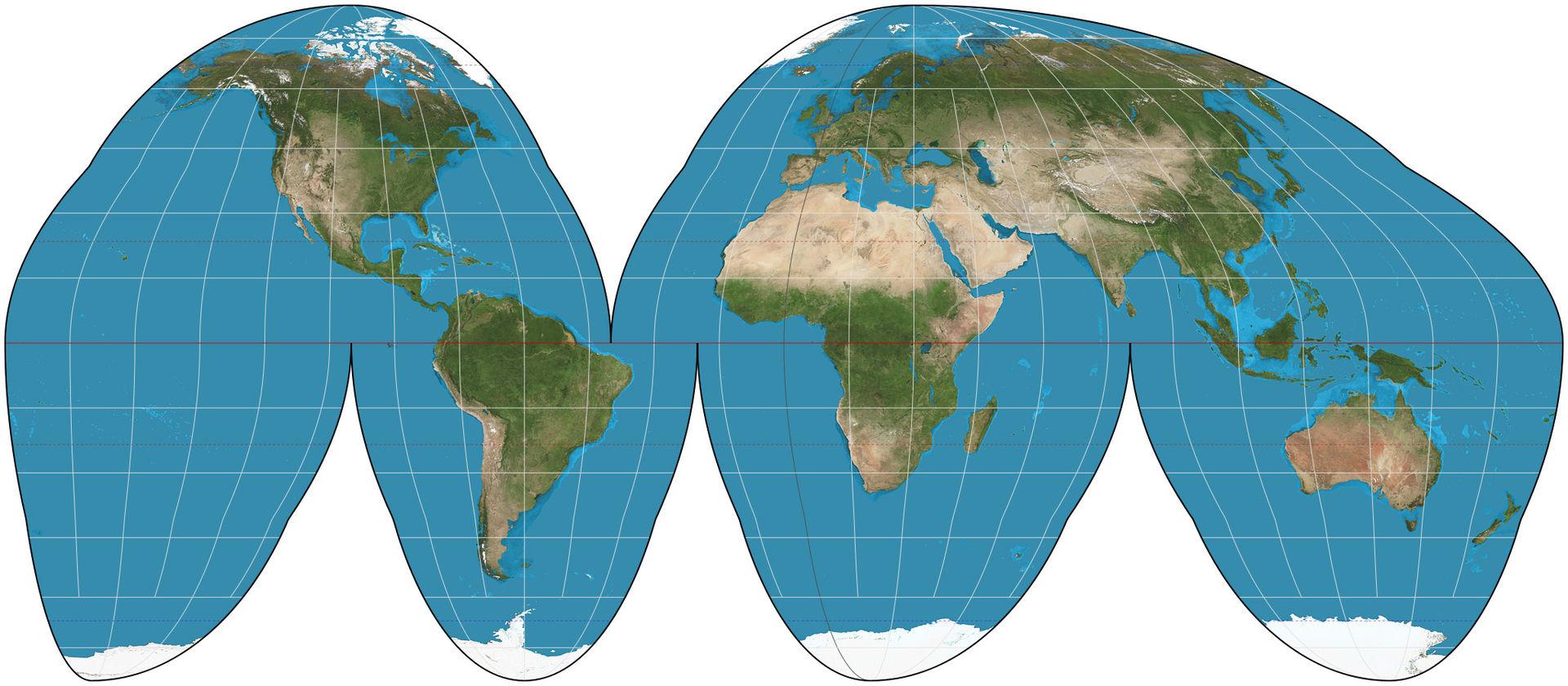
The Goode homolosine projection is often used to represent the entire globe (Figure 2.3.2). An advantage of this projection is that it does not exaggerate distance and area as much as the Mercator projection. But there are significant disadvantages too; obviously there is the problem of the oceans (and Greenland) being split apart in the figure below. Other versions of this projection may keep the oceans somewhat intact, but then the continents are disrupted. There is no way to keep both the oceans and the continents intact with this projection. The homolosine projection is also useless for navigation, as the lines of longitude point in different directions over various parts of the map.
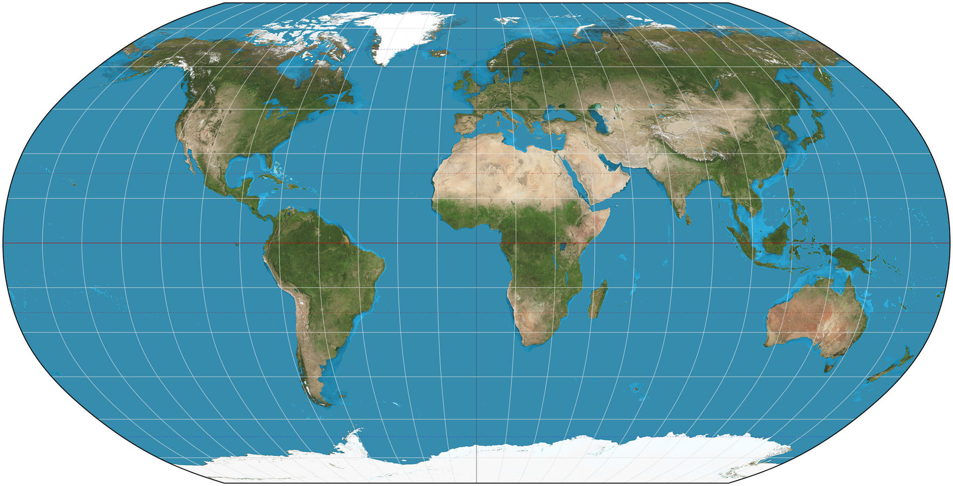
The Robinson planisphere projection (Figure 2.3.3) keeps latitude horizontal, but shows some convergence of longitude. There is still some distortion, but not as much as in a Mercator. This projection is used mostly for data presentation.
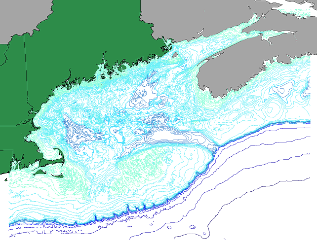
In oceanography, our use of maps is not limited to viewing the Earth’s surface; we also need to see what’s at the bottom of the ocean. Other map types include bathymetric maps (Figure 2.3.4). These are similar to topographic maps for terrestrial locations, with lines connecting areas of equal depth. The closer together the lines, the steeper the feature. In the example below, the steep continental slope is represented by the high density of depth contours as the colors transition from light blue to dark blue. The well-spaced dark blue lines in the bottom right of the figure represent the relatively flat deep seafloor.
Physiographic maps present bathymetry data as a 3D relief map to show ocean features (Figure 2.3.5). It is important to note that they tend to show significant vertical exaggeration. In the example below, there are several hundred kilometers of coastline, while the change in depth from the continental shelf to the seafloor is only a few km.

Additional web links for more information:
- For more on map projections: https://www.axismaps.com/guide/general/map-projections/
- Examples of many types of map projections: https://en.wikipedia.org/wiki/List_of_map_projections
a map projection where latitude and longitude are both represented as straight, parallel lines intersecting at right angles (2.3)
a map projection where area is retained, but there are interruptions to the continents or oceans (2.4)
map projection that keeps latitude horizontal, but shows some convergence of longitude (2.3)
pertains to measuring the depths of the ocean (1.4)
the steeper part of a continental margin, that slopes down from a continental shelf towards the abyssal plain (1.2)
map projection presenting bathymetry or altitude data as a 3D relief map (2.3)
the shallow (typically less than 200 m) and flat sub-marine extension of a continent (1.2)
