11 Statistics in Finance
Statistical analysis is used extensively in finance, with applications ranging from consumer concerns such as credit scores, retirement planning, and insurance to business concerns such as assessing stock market volatility and predicting inflation rates. As a consumer, you will make many financial decisions throughout your life, and many of these decisions will be guided by statistical analysis. For example, what is the probability that interest rates will rise over the next year, and how will that affect your decision on whether to refinance a mortgage? In your retirement planning, how should the investment mix be allocated among stocks and bonds to minimize volatility and ensure a high probability for a secure retirement? When running a business, how can statistical quality control methods be used to maintain high quality levels and minimize waste? Should a business make use of consumer focus groups or customer surveys to obtain business intelligence data to improve service levels? These questions and more can benefit from the use and application of statistical methods.
Running a business and tracking its finances is a complex process. From day-to-day activities such as managing inventory levels to longer-range activities such as developing new products or expanding a customer base, statistical methods are a key to business success. For finance considerations, a business must manage risk versus return and optimize investments to ensure shareholder value. Business managers employ a wide range of statistical processes and tools to accomplish these goals. Increasingly, companies are also
interested in data analytics to optimize the value gleaned from business- and consumer-related data, and statistical analysis forms the core of such analytics.
 13.1
13.1
Measures of Center
By the end of this section, you will be able to:
- Calculate various measures of the average of a data set, such as mean, median, mode, and geometric mean.
- Recognize when a certain measure of center is more appropriate to use, such as weighted mean.
- Distinguish among arithmetic mean, geometric mean, and weighted mean.
Arithmetic Mean
The average of a data set is a way of describing location. The most widely used measures of the center of a data set are the mean (average), median, and mode. The arithmetic mean is the most common measure of the average. We will discuss the geometric mean later.
Note that the words mean and average are often used interchangeably. The substitution of one word for the other is common practice. The technical term is arithmetic mean, and average technically refers only to a center location. Formally, the arithmetic mean is called the first moment of the distribution by mathematicians. However, in practice among non-statisticians, average is commonly accepted as a synonym for arithmetic mean.
To calculate the arithmetic mean value of 50 stock portfolios, add the 50 portfolio dollar values together and divide the sum by 50. To calculate the arithmetic mean for a set of numbers, add the numbers together and then divide by the number of data values.
In statistical analysis, you will encounter two types of data sets: sample data and population data. Population data represents all the outcomes or measurements that are of interest. Sample data represents outcomes or measurements collected from a subset, or part, of the population of interest.


The notationis used to indicate the sample mean, where the arithmetic mean is calculated based on data taken from a sample. The notationis used to denote the sum of the data values, and is used to indicate the number of data values in the sample, also known as the sample size.
The sample mean can be calculated using the following formula:


Finance professionals often rely on averages of Treasury bill auction amounts to determine their value. Table
13.1 lists the Treasury bill auction amounts for a sample of auctions from December 2020.
|
Amount ($Billions) |
|
|
4-week T-bills |
$32.9 |
|
8-week T-bills |
38.4 |
|
13-week T-bills |
63.1 |
|
26-week T-bills |
59.6 |
|
52-week T-bills |
39.7 |
|
Total |
$233.7 |
Table 13.1 United States Treasury Bill Auctions, December 22 and 24, 2020 (source: Treasury Direct)

 To calculate the arithmetic mean of the amount paid for Treasury bills at auction, in billions of dollars, we use the following formula:


Median
To determine the median of a data set, order the data from smallest to largest, and then find the middle value in the ordered data set. For example, to find the median value of 50 portfolios, find the number that splits the data into two equal parts. The portfolio values owned by 25 people will be below the median, and 25 people will have portfolio values above the median. The median is generally a better measure of the average when there are extreme values or outliers in the data set.
An outlier or extreme value is a data value that is significantly different from the other data values in a data set. The median is preferred when outliers are present because the median is not affected by the numerical values of the outliers.
The ordered data set from Table 13.1 appears as follows:


The middle value in this ordered data set is the third data value, which is 39.7. Thus, the median is $39.7 billion.
You can quickly find the location of the median by using the expression. The variable n represents the total number of data values in the sample. If n is an odd number, the median is the middle value of the data
values when ordered from smallest to largest. If n is an even number, the median is equal to the two middle values of the ordered data values added together and divided by 2. In the example from Table 13.1, there are five data values, so n = 5. To identify the position of the median, calculate, which is, or 3. This indicates that the median is located in the third data position, which corresponds to the value 39.7.
As mentioned earlier, when outliers are present in a data set, the mean can be nonrepresentative of the center of the data set, and the median will provide a better measure of center. The following Think It Through example illustrates this point.
 THINK IT THROUGHFinding the Measure of CenterSuppose that in a small village of 50 people, one person earns a salary of $5 million per year, and the other 49 individuals each earn $30,000. Which is the better measure of center: the mean or the median?Solution:The mean, in dollars, would be arrived at mathematically as follows:However, the median would be $30,000. There are 49 people who earn $30,000 and one person who earns$5,000,000.The median is a better measure of the “average” than the mean because 49 of the values are $30,000 and one is $5,000,000. The $5,000,000 is an outlier. The $30,000 gives us a better sense of the middle of the data set.
Mode
Another measure of center is the mode. The mode is the most frequent value. There can be more than one mode in a data set as long as those values have the same frequency and that frequency is the highest. A data set with two modes is called bimodal. For example, assume that the weekly closing stock price for a technology stock, in dollars, is recorded for 20 consecutive weeks as follows:


To find the mode, determine the most frequent score, which is 72. It occurs five times. Thus, the mode of this data set is 72. It is helpful to know that the most common closing price of this particular stock over the past 20 weeks has been $72.00.
Geometric Mean
The arithmetic mean, median, and mode are all measures of the center of a data set, or the average. They are all, in their own way, trying to measure the common point within the data—that which is “normal.” In the case of the arithmetic mean, this is accomplished by finding the value from which all points are equal linear distances. We can imagine that all the data values are combined through addition and then distributed back to each data point in equal amounts.
The geometric mean redistributes not the sum of the values but their product. It is calculated by multiplying all the individual values and then redistributing them in equal portions such that the total product remains the same. This can be seen from the formula for the geometric mean, x̃ (pronounced x-tilde):


The geometric mean is relevant in economics and finance for dealing with growth—of markets, in investments, and so on. For an example of a finance application, assume we would like to know the equivalent percentage growth rate over a five-year period, given the yearly growth rates for the investment.
For a five-year period, the annual rate of return for a certificate of deposit (CD) investment is as follows: 3.21%, 2.79%, 1.88%, 1.42%, 1.17%. Find the single percentage growth rate that is equivalent to these five annual consecutive rates of return. The geometric mean of these five rates of return will provide the solution.
To calculate the geometric mean for these values (which must all be positive), first multiply1 the rates of return together—after adding 1 to the decimal equivalent of each interest rate—and then take the nth root of the product. We are interested in calculating the equivalent overall rate of return for the yearly rates of return, which can be expressed as 1.0321, 1.0279, 1.0188, 1.0142, and 1.0117:


Based on the geometric mean, the equivalent annual rate of return for this time period is 2.09%.
LINK TO LEARNINGArithmetic versus Geometric MeansIn this video on arithmetic versus geometric means (https://openstax.org/r/arithmetic-versus-geometric), the returns of the S&P 500 are tracked using an arithmetic mean versus a geometric mean, and the difference between these two measurements is discussed.
Weighted Mean
A weighted mean is a measure of the center, or average, of a data set where each data value is assigned a corresponding weight. A common financial application of a weighted mean is in determining the average price
- In this chapter, the interpunct dot will be used to indicate the multiplication operation in formulas.
per share for a certain stock when the stock has been purchased at different points in time and at different share prices.
THINK IT THROUGHCalculating the Weighted MeanAssume your portfolio contains 1,000 shares of XYZ Corporation, purchased on three different dates, as shown in Table 13.2. Calculate the weighted mean of the purchase price for the 1,000 shares.Table 13.2 1,000 Shares of XYZ CorporationSolution:In this example, the purchase price is weighted by the number of shares. The sum of the third column is$117,700, and sum of the weights is 1,000. The weighted mean is calculated as $117,700 divided by 1,000, which is $117.70.Thus, the average cost per share for the 1,000 shares of XYZ Corporation is $117.70.
To calculate a weighted mean, create a table with the data values in one column and the weights in a second column. Then create a third column in which each data value is multiplied by each weight on a row-by-row basis. Then, the weighted mean is calculated as the sum of the results from the third column divided by the sum of the weights.
|
|
|||
|
January 17 |
|
200 |
15,600 |
|
February 10 |
122 |
300 |
36,600 |
|
March 23 |
131 |
500 |
65,500 |
|
Total |
NA |
1,000 |
117,700 |
13.2
Measures of Spread
By the end of this section, you will be able to:
- Define and calculate standard deviation for a data set.
- Define and calculate variance for a data set.
- Explain the relationship between standard deviation and variance.
Standard Deviation
An important characteristic of any set of data is the variation in the data. In some data sets, the data values are concentrated close to the mean; in other data sets, the data values are more widely spread out. For example, an investor might examine the yearly returns for Stock A, which are 1%, 2%, -1%, 0%, and 3%, and compare them to the yearly returns for Stock B, which are -9%, 2%, 15%, -5%, and 0%.
Notice that Stock B exhibits more volatility in yearly returns than Stock A. The investor may want to quantify this variation in order to make the best investment decisions for a particular investment objective.
The most common measure of variation, or spread, is standard deviation. The standard deviation of a data set is a measure of how far the data values are from their mean. A standard deviation
- provides a numerical measure of the overall amount of variation in a data set; and
- can be used to determine whether a particular data value is close to or far from the mean.
The standard deviation provides a measure of the overall variation in a data set. The standard deviation is always positive or zero. It is small when the data values are all concentrated close to the mean, exhibiting little variation or spread. It is larger when the data values are more spread out from the mean, exhibiting more variation.
Suppose that we are studying the variability of two different stocks, Stock A and Stock B. The average stock price for both stocks is $5. For Stock A, the standard deviation of the stock price is 2, whereas the standard deviation for Stock B is 4. Because Stock B has a higher standard deviation, we know that there is more variation in the stock price for Stock B than in the price for Stock A.
 There are two different formulas for calculating standard deviation. Which formula to use depends on whether the data represents a sample or a population. The notation s is used to represent the sample standard deviation, and the notationis used to represent the population standard deviation. In the formulas shown below, x̄ is the sample mean,is the population mean, n is the sample size, and N is the population size.
Formula for the sample standard deviation:

Formula for the population standard deviation:

Variance
Variance also provides a measure of the spread of data values. The variance of a data set measures the extent to which each data value differs from the mean. The more the individual data values differ from the mean, the larger the variance. Both the standard deviation and the variance provide similar information.
In a finance application, variance can be used to determine the volatility of an investment and therefore to help guide financial decisions. For example, a more cautious investor might opt for investments with low volatility.
Similar to standard deviation, the formula used to calculate variance also depends on whether the data is collected from a sample or a population. The notation  is used to represent the sample variance, and the notation σ2 is used to represent the population variance.
Formula for the sample variance:


Formula for the population variance:


This is the method to calculate standard deviation and variance for a sample:
 First, find the meanof the data set by adding the data values and dividing the sum by the number of data values.
- Set up a table with three columns, and in the first column, list the data values in the data set.

For each row, subtract the mean from the data value, and enter the difference in the second
column. Note that the values in this column may be positive or negative. The sum of the values in this column will be zero.


In the third column, for each row, square the value in the second column. So this third column will contain the quantity (Data Value – Mean)2 for each row. We can write this quantity as . Note that the values in this third column will always be positive because they represent a squared quantity.
- Add up all the values in the third column. This sum can be written as.

Divide this sum by the quantity (n – 1), where n is the number of data points. We can write this as
.

This result is called the sample variance, denoted by s2. Thus, the formula for the sample variance is
 .
.

Now take the square root of the sample variance. This value is the sample standard deviation, called s.
Thus, the formula for the sample standard deviation is.
- Round-off rule: The sample variance and sample standard deviation are typically rounded to one more decimal place than the data values themselves.
 Finding Standard Deviation and VarianceA brokerage firm advertises a new financial analyst position and receives 210 applications. The ages of a sample of 10 applicants for the position are as follows:The brokerage firm is interested in determining the standard deviation and variance for this sample of 10 ages.Solution:Find the sample variance and sample standard deviation by creating a table with three columns (see Table 13.3).1.2.3.4.5.6.The data set is 40, 36, 44, 51, 54, 55, 39, 47, 44, 50.This data set has 10 data values. Thus,.The mean is calculated as.Column 1 will contain the data values themselves.Column 2 will containColumn 3 will contain..Column 1Column 2Column 340364451Table 13.3 Calculations for Standard Deviation for Age ExampleTHINK IT THROUGH
 Column 1Column 2Column 3545539474450Table 13.3 Calculations for Standard Deviation forAge Example7. To calculate the sample variance, use the sample variance formula:8. To calculate the sample standard deviation, use the sample standard deviation formula:
As the above example illustrates, calculating the variance and standard deviation is a tedious process. A financial calculator can calculate statistical measurements such as mean and standard deviation quickly and efficiently.
There are two steps needed to perform statistical calculations on the calculator:
- Enter the data in the calculator using the [DATA] function, which is located above the 7 key.
- Access the statistical results provided by the calculator using the [STAT] function, which is located above the 8 key.
Follow the steps in Table 13.4 to calculate mean and standard deviation using the financial calculator. The ages data set from the Think It Through example above is used again here: 40, 36, 44, 51, 54, 55, 39, 47, 44, 50.
|
|
|
|
|
2Clear any previous data |
2ND [CLR WORK] X01 |
0.00 |
|
3Enter first data value of 40 |
40 ENTERX01 = |
40.00 |
|
4Move to next data entry |
↓Y01 = |
1.00 |
|
5Move to next data entry |
↓X02 |
0.0 |
|
6Enter second data value of 36 |
36 ENTERX02 = |
36.00 |
Table 13.4 Calculator Steps for Mean and Standard Deviation2
- The specific financial calculator in these examples is the Texas Instruments BA II PlusTM Professional model, but you can use other financial calculators for these types of calculations.
 Step789101112131415Description Move to next data entry Move to next data entry Enter third data value of 44 Move to next data entryContinue to enter remaining data values Enter [STAT] modeMove to first statistical resultMove to next statistical result Move to next statistical resultEnter↓↓44 ENTER↓DisplayY02 =1.00X030.00X03 = 44.00Y03 =1.002nd [STAT]↓↓↓LINn =Sx =10.0046.006.50
Table 13.4 Calculator Steps for Mean and Standard Deviation2
From the statistical results, the mean is shown as 46, and the sample standard deviation is shown as 6.50.
Excel provides a similar analysis using the built-in functions =AVERAGE (for the mean) and =STDEV.S (for the sample standard deviation). To calculate these statistical results in Excel, enter the data values in a column. Let’s assume the data values are placed in cells A2 through A11. In any cell, type the Excel command
=AVERAGE(A2:A11) and press enter. Excel will calculate the arithmetic mean in this cell. Then, in any other cell, type the Excel command =STDEV.S(A2:A11) and press enter. Excel will calculate the sample standard deviation in this cell. Figure 13.2 shows the mean and standard deviation for the 10 ages.
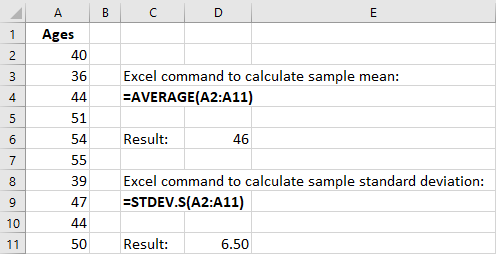
Figure 13.2 Mean and Standard Deviation in Excel.
Relationship between Standard Deviation and Variance
In the formulas shown above for variance and standard deviation, notice that the variance is the square of the standard deviation, and the standard deviation is the square root of the variance.
Once you have calculated one of these values, you can directly calculate the other value. For example, if you know the standard deviation of a data set is 12.5, you can calculate the variance by squaring this standard deviation. The variance is then 12.52, which is 156.25.
In the same way, if you know the value of the variance, you can determine the standard deviation by calculating the square root of the variance. For example, if the variance of a data set is known to be 31.36, then the standard deviation can be calculated as the square root of 31.36, which is 5.6.
One disadvantage of using the variance is that the variance is measured in square units, which are different from the units in the data set. For example, if the data set consists of ages measured in years, then the variance would be measured in years squared, which can be confusing. The standard deviation is measured in the same units as the original data set, and thus the standard deviation is used more commonly than the variance to measure the spread of a data set.
13.3
Measures of Position
By the end of this section, you will be able to:
- Define and calculate z-scores for a measurement.
- Define and calculate quartiles and percentiles for a data set.
- Use quartiles as a method to detect outliers in a data set.
Scores
A z-score, also called a z-value, is a measure of the position of an entry in a data set. It represents the number of standard deviations by which a data value differs from the mean. For example, suppose that in a certain year, the rates of return for various technology-focused mutual funds are examined, and the mean return is 7.8% with a standard deviation of 2.3%. A certain mutual fund publishes its rate of return as 12.4%. Based on this rate of return of 12.4%, we can calculate the relative standing of this mutual fund compared to the other technology-focused mutual funds. The corresponding z-score of a measurement considers the given measurement in relation to the mean and standard deviation for the entire population.
The formula for a z-score calculation is as follows:


where x is the measurement,is the mean, andis the standard deviation.
 Interpreting a z-ScoreA certain technology-based mutual fund reports a rate of return of 12.4% for a certain year, while the mean rate of return for comparable funds is 7.8% and the standard deviation is 2.3%. Calculate and interpret the z-score for this particular mutual fund.Solution:In this example, the measurementcalculation is performed as follows:andUsing the z-score formula, theThe resulting z-score indicates the number of standard deviations by which a particular measurement is above or below the mean. In this example, the rate of return for this particular mutual fund is 2 standard deviations above the mean, indicating that this mutual fund generated a significantly better rate of returnthan all other technology-based mutual funds for the same time period.THINK IT THROUGH
Quartiles and Percentiles
If a person takes an IQ test, their resulting score might be reported as in the 87th percentile. This percentile indicates the person’s relative performance compared to others taking the IQ test. A person scoring in the 87th percentile has an IQ score higher than 87% of all others taking the test. This is the same as saying that the
person is in the top 13% of all people taking the IQ test.
Common measures of location are quartiles and percentiles. Quartiles are special percentiles. The first quartile, Q1, is the same as the 25th percentile, and the third quartile, Q3, is the same as the 75th percentile. The median, M, is called both the second quartile and the 50th percentile.
To calculate quartiles and percentiles, the data must be ordered from smallest to largest. Quartiles divide ordered data into quarters. Percentiles divide ordered data into hundredths. If you score in the 90th percentile of an exam, that does not necessarily mean that you receive 90% on the test. It means that 90% of the test scores are the same as or less than your score and the remaining 10% of the scores are the same as or greater than your score.
Percentiles are useful for comparing values. In a finance example, a mutual fund might report that the performance for the fund over the past year was in the 80th percentile of all mutual funds in the peer group. This indicates that the fund performed better than 80% of all other funds in the peer group. This also indicates that 20% of the funds performed better than this particular fund.
Quartiles are values that separate the data into quarters. Quartiles may or may not be part of the data. To find the quartiles, first find the median, or second quartile. The first quartile, Q1, is the middle value, or median, of the lower half of the data, and the third quartile, Q3, is the middle value of the upper half of the data. As an example, consider the following ordered data set, which represents the rates of return for a group of technology-based mutual funds in a certain year:


The median, or second quartile, is the middle value in this data set, which is 7.2. Notice that 50% of the data values are below the median, and 50% of the data values are above the median. The lower half of the data values are 5.4, 6.0, 6.3, 6.8, 7.1 Notice that these are the data values below the median. The upper half of the data values are 7.4, 7.5, 7.9, 8.2, 8.7, which are the data values above the median.)
To find the first quartile, Q1, locate the middle value of the lower half of the data. The middle value of the lower half of the data set is 6.3. Notice that one-fourth, or 25%, of the data values are below this first quartile, and 75% of the data values are above this first quartile.
To find the third quartile, Q3, locate the middle value of the upper half of the data. The middle value of the upper half of the data set is 7.9. Notice that one-fourth, or 25%, of the data values are above this third quartile, and 75% of the data values are below this third quartile.
The interquartile range (IQR) is a number that indicates the spread of the middle half, or the middle 50%, of the data. It is the difference between the third quartile, Q3, and the first quartile, Q1.


In the above example, the IQR can be calculated as


Outlier Detection
Quartiles and the IQR can be used to flag possible outliers in a data set. For example, if most employees at a company earn about $50,000 and the CEO of the company earns $2.5 million, then we consider the CEO’s salary to be an outlier data value because is significantly different from all the other salaries in the data set. An outlier data value can also be a value much lower than the other data values, so if one employee only makes
$15,000, then this employee’s low salary might also be considered an outlier.
To detect outliers, use the quartiles and the IQR to calculate a lower and an upper bound for outliers. Then any data values below the lower bound or above the upper bound will be flagged as outliers. These data values should be further investigated to determine the nature of the outlier condition.
To calculate the lower and upper bounds for outliers, use the following formulas:


 THINK IT THROUGHCalculating the IQRCalculate the IQR for the following 13 portfolio values, and determine if any of the portfolio values are potential outliers. Data values are in dollars.389,950; 230,500; 158,000; 479,000; 639,000; 114,950; 5,500,000; 387,000; 659,000; 529,000; 575,000; 488,800;1,095,000Solution:Order the data from smallest to largest.114,950; 158,000; 230,500; 387,000; 389,950; 479,000; 488,800; 529,000; 575,000; 639,000; 659,000; 1,095,000;5,500,000No portfolio value price is less than -201,625. However, 5,500,000 is more than 1,159,375. Therefore, the portfolio value of 5,500,000 is a potential outlier. This is important because the presence of outliers could potentially indicate data errors or some other anomalies in the data set that should be investigated.
13.4
Statistical Distributions
By the end of this section, you will be able to:
- Construct and interpret a frequency distribution.
- Apply and evaluate probabilities using the normal distribution.
- Apply and evaluate probabilities using the exponential distribution.
Frequency Distributions
A frequency distribution provides a method to organize and summarize a data set. For example, we might be interested in the spread, center, and shape of the data set’s distribution. When a data set has many data values, it can be difficult to see patterns and come to conclusions about important characteristics of the data. A frequency distribution allows us to organize and tabulate the data in a summarized way and also to create graphs to help facilitate an interpretation of the data set.
To create a basic frequency distribution, set up a table with three columns. The first column will show the intervals for the data, and the second column will show the frequency of the data values, or the count of how
many data values fall within each interval. A third column can be added to include the relative frequency for each row, which is calculated by taking the frequency for that row and dividing it by the sum of all the frequencies in the table.
THINK IT THROUGH
Graphing Demand and Supply
A financial consultant at a brokerage firm records the portfolio values for 20 clients, as shown in Table 13.5, where the portfolio values are shown in thousands of dollars.
735798864903944
1,052 1,099 1,132 1,180 1,279
1,365 1,471 1,572 1,787 1,905
Table 13.5 Portfolio Values for 20 Clients at a Brokerage Firm ($000s)
Create a frequency distribution table using the following intervals for the portfolio values:
0–299
300–599
600–899
900–1,199
1,200–1,499
1,500–1,799
1,800–2,099
Solution:
Create a table where the intervals for portfolio value are listed in the first column. For this example, it was decided to create a frequency distribution table with seven rows and a class width set to 300. The class width is the distance from the start of one interval to the start of the next interval in the subsequent row. For example, the interval for the second row starts at 300, the interval for the third row starts at 600, and so on.
In the second column, record the frequency, or the number of data values that fall within the interval, for each row. For example, for the first row, count the number of data values that fall between 0 and 299.
Because there is only one data value (278) that falls in this interval, the corresponding frequency is 1. For the second row, there are 3 data values that fall between 300 and 599 (318, 422, and 577). Thus, the frequency for the second row is 3.
For the third column, called relative frequency, take the frequency for each row and divide it by the sum of the frequencies, which is 20. For example, in the first row, the relative frequency will be 1 divided by 20, which is 0.05. The relative frequency for the second row will be 3 divided by 20, which is 0.15. The resulting frequency distribution table is shown in Table 13.6.
|
|
||
|
0–299 |
|
0.05 |
|
300–599 |
3 |
0.15 |
|
600–899 |
4 |
0.20 |
|
900–1,199 |
6 |
0.30 |
|
1,200–1,499 |
3 |
0.15 |
|
1,500–1,799 |
2 |
0.10 |
|
1,800–2,099 |
1 |
0.05 |
Table 13.6 Frequency Distribution of Portfolio Values for 20 Clients at a Brokerage Firm ($000s)
The frequency table indicates that most customers have portfolio values between $300,000 and $599,000, as this row in the table shows the highest frequency. Very few customers have portfolios with a value below
$299,000 or above $1,800,000, as these frequencies in these rows are very low. Because the highest frequency corresponds to the row in the middle of the table and the frequencies decrease with each interval below and above this middle interval, the frequency table indicates that this distribution is a bell- shaped distribution.
The following is a summary of how to create a frequency distribution table (for integer data). Note that the number of classes in a frequency table is the same as the number of rows in the table.
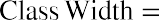 Calculate the class width using the formula
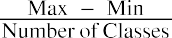
- Note: For integer data, round the class width up to the next whole number.
- Create a table with a number of rows equal to the number of classes. Create columns for Lower Class Limit, Upper Class Limit, Frequency, and Relative Frequency.
- Set the lower class limit for the first row equal to the minimum value from the data set, or some other appropriate value.
- Calculate the lower class limit for the second row by adding the class width to the lower class limit from the first row. Add the class width to each new lower class limit to calculate the lower class limit for each subsequent row.
- The upper class limit for each row is 1 less than the lower class limit of the subsequent row. You can also add the class width to each upper class limit to determine the upper class limit for the subsequent row.
- Record the frequency for each row by counting how many data values fall between the lower class limit and the upper class limit for that row.
- Calculate the relative frequency for each row by taking the frequency for that row and dividing by the total number of data values.
Normal Distribution

The normal probability density function, a continuous distribution, is the most important of all the distributions. The normal distribution is applicable when the frequency of data values decreases with each class above and below the mean. The normal distribution can be applied to many examples from the finance industry, including average returns for mutual funds over a certain time period, portfolio values, and others. The normal distribution has two parameters, or numerical descriptive measures: the mean, , and the standard deviation, . The variable x represents the quantity being measured whose data values have a
normal distribution.
Figure 13.3 Graph of the Normal Distribution


 The curve in Figure 13.3 is symmetric about a vertical line drawn through the mean, . The mean is the same as the median, which is the same as the mode, because the graph is symmetric about . As the notation indicates, the normal distribution depends only on the mean and the standard deviation. Because the area under the curve must equal 1, a change in the standard deviation, , causes a change in the shape of the normal curve; the curve becomes fatter and wider or skinnier and taller depending on . A change incauses the graph to shift to the left or right. This means there are an infinite number of normal probability distributions.
To determine probabilities associated with the normal distribution, we find specific areas under the normal curve, and this is further discussed in Apply the Normal Distribution in Financial Contexts. For example, suppose that at a financial consulting company, the mean employee salary is $60,000 with a standard deviation of $7,500. A normal curve can be drawn to represent this scenario, in which the mean of $60,000 would be plotted on the horizontal axis, corresponding to the peak of the curve. Then, to find the probability that an employee earns more than $75,000, you would calculate the area under the normal curve to the right of the data value $75,000.
Excel uses the following command to find the area under the normal curve to the left of a specified value:
=NORM.DIST(XVALUE, MEAN, STANDARD_DEV, TRUE)
For example, at the financial consulting company mentioned above, the mean employee salary is $60,000 with a standard deviation of $7,500. To find the probability that a random employee’s salary is less than $55,000 using Excel, this is the command you would use:
=NORM.DIST(55000, 60000, 7500, TRUE)
Result: 0.25249
Thus, there is a probability of about 25% that a random employee has a salary less than $55,000.
Exponential Distribution
The exponential distribution is often concerned with the amount of time until some specific event occurs. For example, a finance professional might want to model the time to default on payments for company debt holders.
An exponential distribution is one in which there are fewer large values and more small values. For example, marketing studies have shown that the amount of money customers spend in a store follows an exponential distribution. There are more people who spend small amounts of money and fewer people who spend large amounts of money.
Exponential distributions are commonly used in calculations of product reliability, or the length of time a product lasts. The random variable for the exponential distribution is continuous and often measures a
passage of time, although it can be used in other applications. Typical questions may be, What is the probability that some event will occur between x1 hours and x2 hours? or What is the probability that the event will take more than x1 hours to perform? In these examples, the random variable x equals either the time between events or the passage of time to complete an action (e.g., wait on a customer). The probability density function is given by


whereis the historical average of the values of the random variable (e.g., the historical average waiting time). This probability density function has a mean and standard deviation of.

To determine probabilities associated with the exponential distribution, we find specific areas under the exponential distribution curve. The following formula can be used to calculate the area under the exponential curve to the left of a certain value:


 THINK IT THROUGHCalculating ProbabilityAt a financial company, the mean time between incoming phone calls is 45 seconds, and the time between phone calls follows an exponential distribution, where the time is measured in minutes. Calculate the probability of having 2 minutes or less between phone calls.Solution:To calculate the probability, find the area under the curve to the left of 1 minute. The mean time is given as 45 seconds, which is the same as 0.75 minutes. The probability can then be calculated as follows:
13.5
Probability Distributions
By the end of this section, you will be able to:
- Calculate portfolio weights in an investment.
- Calculate and interpret the expected values.
- Apply the normal distribution to characterize average and standard deviation in financial contexts.
Calculate Portfolio Weights
In many financial analyses, the weightings by asset category in a portfolio are a key index used to assess if the portfolio is meeting allocation metrics. For example, an investor approaching retirement age may wish to shift assets in a portfolio to more conservative and lower-volatility investments. Weightings can be calculated in several different ways—for example, based on individual stocks in a portfolio or on various sectors in a portfolio. Weightings can also be calculated based on number of shares or the value of shares of a stock.
To calculate a weighting in a portfolio based on value, take the value of the particular investment and divide it by the total value of the overall portfolio. As an example, consider an individual’s retirement account for which the desired portfolio weighting is determined to be 40% stocks, 50% bonds, and 10% cash equivalents. Table
13.7 shows the current assets in the individual’s portfolio, broken out according to stocks, bonds, and cash equivalents.
|
Value ($) |
|
|
Stock A |
134,000 |
|
Stock B |
172,000 |
|
Bond C |
38,000 |
|
Bond D |
102,000 |
|
Bond E |
96,000 |
|
Cash in CDs |
35,700 |
|
Cash in savings |
22,500 |
|
Total Value |
600,200 |
Table 13.7 Portfolio Assets in Stocks, Bonds, and Cash Equivalents
To determine the weighting in this portfolio for stocks, bonds, and cash, take the total value for each category and divide it by the total value of the entire portfolio. These results are summarized in Table 13.8. Notice that the portfolio weightings shown in the table do not match the target, or desired, allocation weightings of 40% stocks, 50% bonds, and 10% cash equivalents.
 Asset Category Category Value ($) Portfolio WeightingStocks Bonds CashTotal Value
Table 13.8 Portfolio Weightings for Stocks, Bonds, and Cash Equivalents
Portfolio rebalancing is a process whereby the investor buys or sells assets to achieve the desired portfolio weightings. In this example, the investor could sell approximately 10% of the stock assets and purchase bonds with the proceeds to align the asset categories to the desired portfolio weightings.
Calculate and Interpret Expected Values
A probability distribution is a mathematical function that assigns probabilities to various outcomes. For example, we can assign a probability to the outcome of a certain stock increasing in value or decreasing in value. One application of a probability distribution function is determining expected value.
In many financial situations, we are interested in determining the expected value of the return on a particular investment or the expected return on a portfolio of multiple investments. To calculate expected returns, we formulate a probability distribution and then use the following formula to calculate expected value:


where P1, P2, P3, ⋯ Pn are the probabilities of the various returns and R1, R2, R3, ⋯ Rn are the various rates of return.
In essence, expected value is a weighted mean where the probabilities form the weights. Typically, these values for Pn and Rn are derived from historical data. As an example, consider a probability distribution for
potential returns for United Airlines common stock. Assume that from historical data gathered over a certain time period, there is a 15% probability of generating a 12% return on investment for this stock, a 35% probability of generating a 5% return, a 25% probability of generating a 2% return, a 14% probability of generating a 5% loss, and an 11% probability of resulting in a 10% loss. This data can be organized into a probability distribution table as seen in Table 13.9.
Using the expected value formula, the expected return of United Airlines stock over an extended period of time follows:


Based on the probability distribution, the expected value of the rate of return for United Airlines common stock over an extended period of time is 2.25%.
|
|
15 |
|
5 |
35 |
|
2 |
25 |
|
-5 |
14 |
|
-10 |
11 |
Table 13.9 Probability Distribution for Historical Returns on United Airlines Stock
We can extend this analysis to evaluate the expected return for an investment portfolio consisting of various asset categories, such as stocks, bonds, and cash equivalents, where the probabilities are associated with the weighting of each category relative to the total value of the portfolio. Using historical return data for each of the asset categories, the expected return of the overall portfolio can be calculated using the expected value formula.
Assume an investor has assets in stocks, bonds, and cash equivalents as shown in Table 13.10.
 Asset Category Value ($) Portfolio Weighting Historical Return (%)Stocks13.0 Bonds4.0Cash2.5Total Value
Table 13.10 Portfolio Weightings and Historical Returns for Various Asset Categories


Based on the probability distribution, the expected value of the rate of return for this portfolio over an extended period of time is 8.44%.
Apply the Normal Distribution in Financial Contexts
The normal, or bell-shaped, distribution can be utilized in many applications, including financial contexts.
Remember that the normal distribution has two parameters: the mean, which is the center of the distribution, and the standard deviation, which measures the spread of the distribution. Here are several examples of applications of the normal distribution:
- IQ scores follow a normal distribution, with a mean IQ score of 100 and a standard deviation of 15.
- Salaries at a certain company follow a normal distribution, with a mean salary of $52,000 and a standard deviation of $4,800.
- Grade point averages (GPAs) at a certain college follow a normal distribution, with a mean GPA of 3.27 and a standard deviation of 0.24.
- The average annual gain of the Dow Jones Industrial Average (DJIA) over a 40-year time period follows a normal distribution, with a mean gain of 485 points and a standard deviation of 1,065 points.
- The average annual return on the S&P 500 over a 50-year time period follows a normal distribution, with a mean rate of return of 10.5% and a standard deviation of 14.3%.
- The average annual return on mid-cap stock funds over the five-year period from 2010 to 2015 follows a normal distribution, with a mean rate of return of 8.9% and a standard deviation of 3.7%.
When analyzing data sets that follow a normal distribution, probabilities can be calculated by finding areas under the normal curve. To find the probability that a measurement is within a specific interval, we can compute the area under the normal curve corresponding to the interval of interest.
Areas under the normal curve are available in tables, and Excel also provides a method to find these areas. The empirical rule is one method for determining areas under the normal curve that fall within a certain number of standard deviations of the mean (see Figure 13.4).
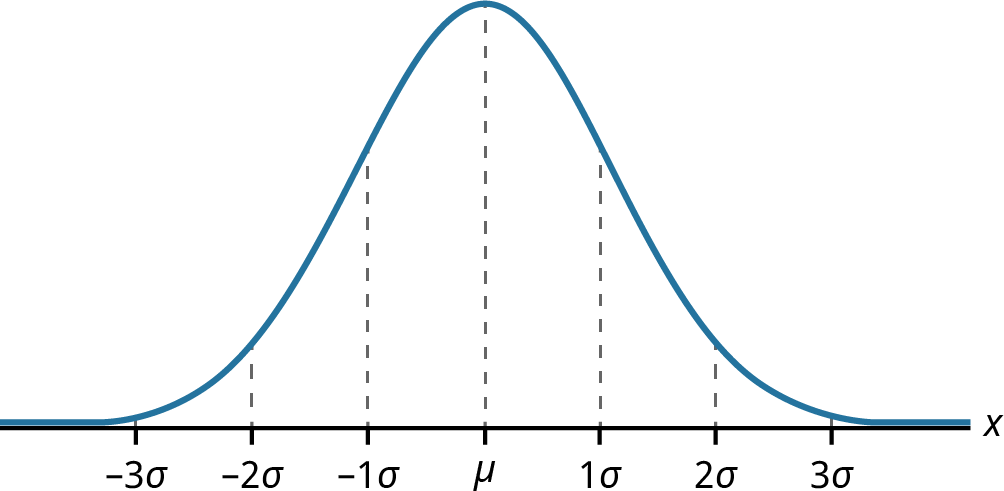
Figure 13.4 Normal Distribution Showing Mean and Increments of Standard Deviation
If x is a random variable and has a normal distribution with mean µ and standard deviation , then the empirical rule states the following:
|
|
|
|
|
of the mean). |
|
|
|
|
|
|
|
deviations of the mean). |
|
|
|
About 99.7% of the x-values lie between |
|
|


deviations of the mean). Notice that almost all the x-values lie within three standard deviations of the mean.


The z-scores forandareand, respectively.


The z-scores forandareand, respectively.


The z-scores forandareand, respectively.
As an example of using the empirical rule, suppose we know that the average annual return for mid-cap stock funds over the five-year period from 2010 to 2015 follows a normal distribution, with a mean rate of return of 8.9% and a standard deviation of 3.7%. We are interested in knowing the likelihood that a randomly selected mid-cap stock fund provides a rate of return that falls within one standard deviation of the mean, which
implies a rate of return between 5.2% and 12.6%. Using the empirical rule, the area under the normal curve within one standard deviation of the mean is 68%. Thus, there is a probability, or likelihood, of 0.68 that a mid- cap stock fund will provide a rate of return between 5.2% and 12.6%.
If the interval of interest is extended to two standard deviations from the mean (a rate of return between 1.5% and 16.3%), using the empirical rule, we can determine that the area under the normal curve within two standard deviations of the mean is 95%. Thus, there is a probability, or likelihood, of 0.95 that a mid-cap stock fund will provide a rate of return between 1.5% and 16.3%.
13.6
Data Visualization and Graphical Displays
By the end of this section, you will be able to:
- Determine appropriate graphs to use for various types of data.
- Create and interpret univariate graphs such as bar graphs and histograms.
- Create and interpret bivariate graphs such as time series graphs and scatter plot graphs.
Graphing Univariate Data
Data visualization refers to the use of graphical displays to summarize data to help to interpret patterns and trends in the data. Univariate data refers to observations recorded for a single characteristic or attribute, such as salaries or blood pressure measurements. When graphing univariate data, we can choose from among several types of graphs, such as bar graphs, time series graphs, and so on.
The most effective type of graph to use for a certain data set will depend on the nature of the data and the purpose of the graph. For example, a time series graph is typically used to show how a measurement is changing over time and to identify patterns or trends over time.
Below are some examples of typical applications for various graphs and displays. Graphs used to show the distribution of data:
- Bar chart: used to show frequency or relative frequency distributions for categorical data
- Histogram: used to show frequency or relative frequency distributions for continuous data Graphs used to show relationships between data points:
- Time series graph: used to show measurement data plotted against time, where time is displayed on the horizontal axis
- Scatter plot: used to show the relationship between a dependent variable and an independent variable
Bar Graphs
A bar graph consists of bars that are separated from each other and compare percentages. The bars can be rectangles, or they can be rectangular boxes (used in three-dimensional plots), and they can be vertical or horizontal. The bar graph shown in the example below has age groups represented on the x-axis and proportions on the y-axis.
By the end of 2021, a certain social media site had over 146 million users in the United States. Table 13.11 shows three age groups, the number of users in each age group, and the proportion (%) of users in each age group. A bar graph using this data is shown in Figure 13.5.
|
13–25 |
|
|
|
26–44 |
53,300,200 |
36 |
Table 13.11 Data for Bar Graph of Age Groups
|
|
Number of Site Users |
Percent of Site Users |
|
45–64 |
27,885,100 |
19 |
Table 13.11 Data for Bar Graph of Age Groups
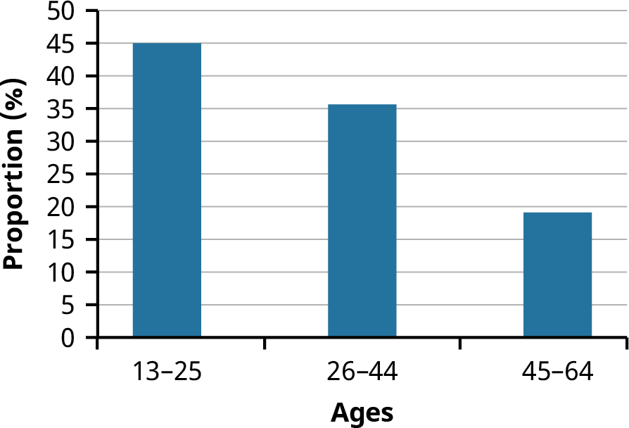
Figure 13.5 Bar Graph of Age Groups
A histogram is a bar graph that is used for continuous numeric data, such as salaries, blood pressures, heights, and so on. One advantage of a histogram is that it can readily display large data sets. A rule of thumb is to use a histogram when the data set consists of 100 values or more.
A histogram consists of contiguous (adjoining) boxes. It has both a horizontal axis and a vertical axis. The horizontal axis is labeled with what the data represents (for instance, distance from your home to school). The vertical axis is labeled either Frequency or Relative Frequency (or Percent Frequency or Probability). The graph will have the same shape regardless of the label on the vertical axis. A histogram, like a stem-and-leaf plot, can give you the shape of the data, the center, and the spread of the data.
The relative frequency is equal to the frequency of an observed data value divided by the total number of data values in the sample. Remember, frequency is defined as the number of times a solution occurs. Relative frequency is calculated using the formula


where f = frequency, n = the total number of data values (or the sum of the individual frequencies), and RF = relative frequency.
To construct a histogram, first decide how many bars or intervals, also called classes, will represent the data. Many histograms consist of 5 to 15 bars or classes for clarity. The number of bars needs to be chosen. Choose a starting point for the first interval that is less than the smallest data value. A convenient starting point is a lower value carried out to one more decimal place than the value with the most decimal places. For example, if the value with the most decimal places is 6.1, and if this is the smallest value, a convenient starting point is


6.05 (because). We say that 6.05 has more precision. If the value with the most decimal places is 2.23 and the lowest value is 1.5, a convenient starting point is 1.495 (). If the value with the most decimal places is 3.234 and the lowest value is 1.0, a convenient starting point is


. If all the data values happen to be integers and the smallest value is 2, then a convenient starting point is. Also, when the starting point and other boundaries are carried to one additional decimal place, no data value will fall on a boundary. The next two examples go into detail about how to construct a histogram using continuous data and how to create a histogram using discrete data.
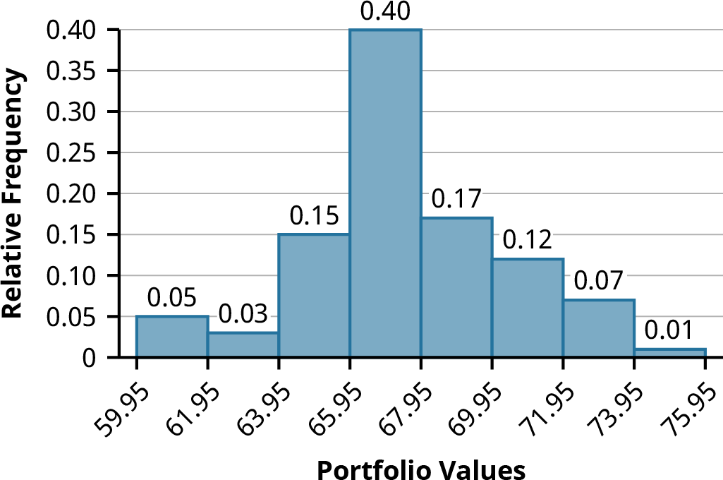
Example: The following data values are the portfolio values, in thousands of dollars, for 100 investors. 60, 60.5, 61, 61, 61.5
63.5, 63.5, 63.5
64, 64, 64, 64, 64, 64, 64, 64.5, 64.5, 64.5, 64.5, 64.5, 64.5, 64.5, 64.5
66, 66, 66, 66, 66, 66, 66, 66, 66, 66, 66.5, 66.5, 66.5, 66.5, 66.5, 66.5, 66.5, 66.5, 66.5, 66.5, 66.5, 67, 67, 67, 67, 67,
67, 67, 67, 67, 67, 67, 67, 67.5, 67.5, 67.5, 67.5, 67.5, 67.5, 67.5
68, 68, 69, 69, 69, 69, 69, 69, 69, 69, 69, 69, 69.5, 69.5, 69.5, 69.5, 69.5
70, 70, 70, 70, 70, 70, 70.5, 70.5, 70.5, 71, 71, 71
72, 72, 72, 72.5, 72.5, 73, 73.5
74


 The smallest data value is 60. Because the data values with the most decimal places have one decimal place (for instance, 61.5), we want our starting point to have two decimal places. Because the numbers 0.5, 0.05, 0.005, and so on are convenient numbers, use 0.05 and subtract it from 60, the smallest value, to get a convenient starting point:, which is more precise than, say, 61.5 by one decimal place. Thus, the starting point is 59.95. The largest value is 74, and, so 74.05 is the ending value.


Next, calculate the width of each bar or class interval. To calculate this width, subtract the starting point from the ending value and divide the result by the number of bars (you must choose the number of bars you desire). Suppose you choose eight bars. The interval width is calculated as follows:
We will round up to 2 and make each bar or class interval 2 units wide. Rounding up to 2 is one way to prevent a value from falling on a boundary. Rounding to the next number is often necessary, even if it goes against the standard rules of rounding. For this example, using 1.76 as the width would also work. A guideline that is followed by some for the width of a bar or class interval is to take the square root of the number of data values and then round to the nearest whole number if necessary. For example, if there are 150 data values, take the square root of 150 and round to 12 bars or intervals. The boundaries are as follows:


The data values 60 through 61.5 are in the interval 59.95–61.95. The data values of 63.5 are in the interval 61.95–63.95. The data values of 64 and 64.5 are in the interval 63.95–65.95. The data values 66 through 67.5 are in the interval 65.95–67.95. The data values 68 through 69.5 are in the interval 67.95–69.95. The data values 70 through 71 are in the interval 69.95–71.95. The data values 72 through 73.5 are in the interval 71.95–73.95. The data value 74 is in the interval 73.95–75.95. The histogram shown in Figure 13.6 displays the portfolio values on the x-axis and relative frequency on the y-axis.
Graphing Bivariate Data
Figure 13.6 Histogram of Portfolio Values
Bivariate data refers to paired data, where each value of one variable is paired with a value of a second variable. An example of paired data would be if data were collected on employees’ years of experience and their corresponding salaries. Typically, it is of interest to investigate possible associations or correlations between the two variables under analysis.
Time Series Graphs
Suppose that we want to track the consumer price index (CPI) over the past 10 years. One feature of the data that we may want to consider is the element of time. Because each year is paired with the CPI value for that year, we do not have to think of the data as being random. We can instead use the years given to impose a chronological order on the data. A graph that recognizes this ordering and displays the changing CPI value as the decade progresses is called a time series graph.
To construct a time series graph, we must look at both pieces of our paired data set. We start with a standard Cartesian coordinate system. The horizontal axis is used to plot the time increments, and the vertical axis is used to plot the values of the variable that we are measuring. By doing this, we make each point on the graph correspond to a point in time and a measured quantity. The points on the graph are typically connected by straight lines in the order in which they occur.
Example: The following data set shows the annual CPI for 10 years. We need to construct a time series graph for the (rounded) annual CPI data (see Table 13.12). The time series graph is shown in Figure 13.7.
Year CPI2012 226.652013 230.282014 233.91
Table 13.12 Data for Time Series Graph of Annual CPI, 2012–2021
(source: US Bureau of Labor Statistics)
Year CPI2015 233.702016 236.912017 242.842018 247.872019 251.712020 257.972021 261.58
Table 13.12 Data for Time Series Graph of Annual CPI, 2012–2021
(source: US Bureau of Labor Statistics)
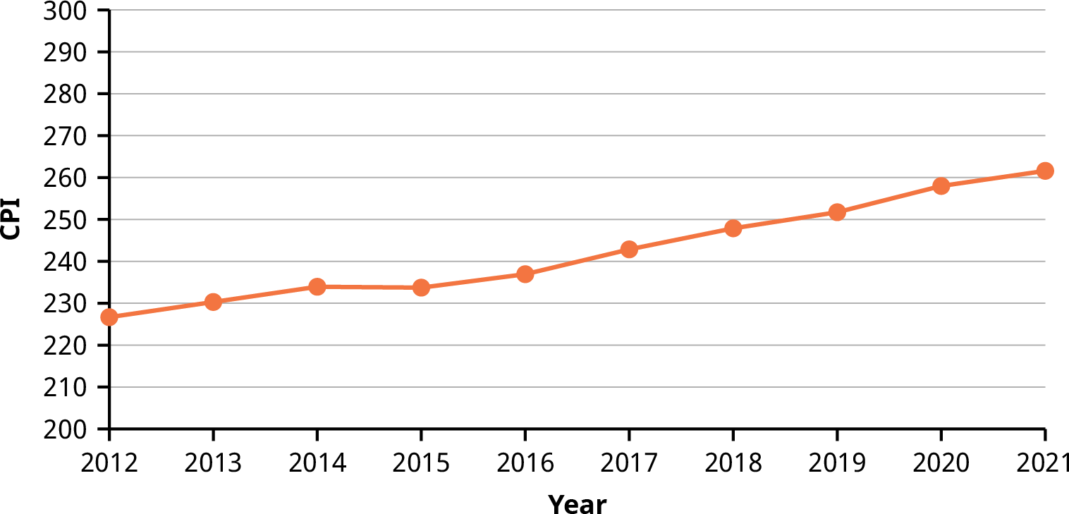
Figure 13.7 Time Series Graph of Annual CPI, 2012–2021
A scatter plot, or scatter diagram, is a graphical display intended to show the relationship between two variables. The setup of the scatter plot is that one variable is plotted on the horizontal axis and the other variable is plotted on the vertical axis. Then each pair of data values is considered as an (x, y) point, and the various points are plotted on the diagram. A visual inspection of the plot is then made to detect any patterns or trends. Additional statistical analysis can be conducted to determine if there is a correlation or other statistically significant relationship between the two variables.
Assume we are interested in tracking the closing price of Nike stock over the one-year time period from April 2020 to March 2021. We would also like to know if there is a correlation or relationship between the price of Nike stock and the value of the S&P 500 over the same time period. To visualize this relationship, we can create a scatter plot based on the (x, y) data shown in Table 13.13. The resulting scatter plot is shown in Figure 13.8.
|
4/1/2020 2,912.43 |
87.18 |
|
5/1/2020 3,044.31 |
98.58 |
|
6/1/2020 3,100.29 |
98.05 |
|
7/1/2020 3,271.12 |
97.61 |
|
8/1/2020 3,500.31 |
111.89 |
|
9/1/2020 3,363.00 |
125.54 |
|
10/1/2020 3,269.96 |
120.08 |
|
11/1/2020 3,621.63 |
134.70 |
|
12/1/2020 3,756.07 |
141.47 |
|
1/1/2021 3,714.24 |
133.59 |
|
2/1/2021 3,811.15 |
134.78 |
|
3/1/2021 3,943.34 |
140.45 |
|
3/12/2021 3,943.34 |
140.45 |
Table 13.13 Data for S&P 500 and Nike Stock Price over a 12-Month Period (source: Yahoo! Finance)
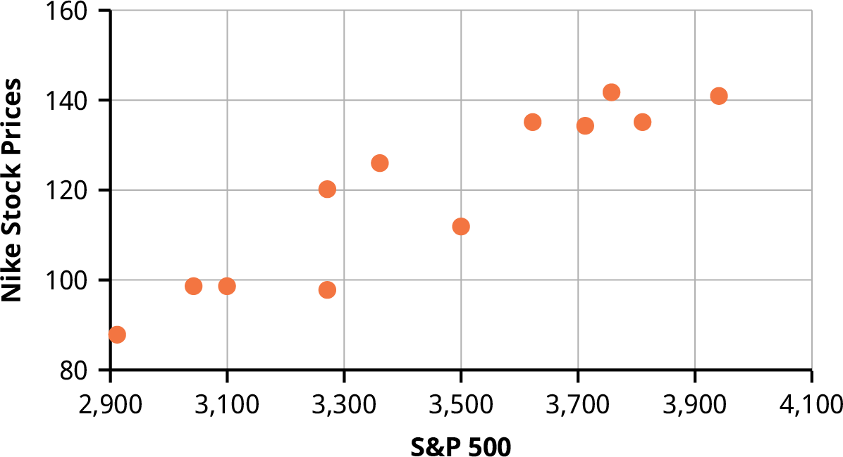
Figure 13.8 Scatter Plot of Nike Stock Price versus S&P 500
Note the linear pattern of the points on the scatter plot. Because the data points generally align along a straight line, this provides an indication of a linear correlation between the price of Nike stock and the value of the S&P 500 over this one-year time period.
The scatter plot can be generated using Excel as follows:
- Enter the x-data in column A of a spreadsheet.
- Enter the y-data in column B.
- Highlight the data with your mouse.
- Go to the Insert menu and select the icon for a scatter plot, as shown in Figure 13.9.
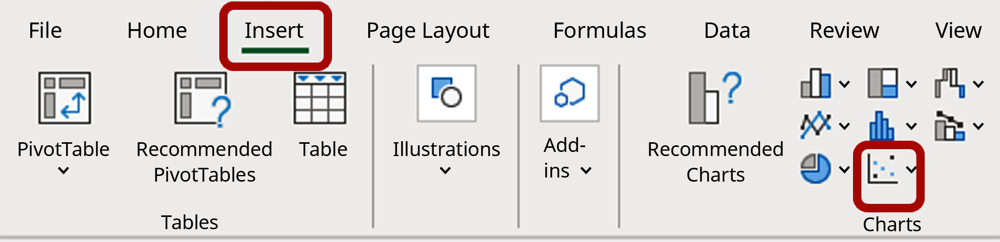
Figure 13.9 Excel Menu Showing the Scatter Plot Icon
13.7
The R Statistical Analysis Tool
By the end of this section, you will be able to:
- Create a vector of data values for the R statistical analysis tool.
- Write basic statistical commands using the R statistical analysis tool.
Commands and Vectors in R
R is a statistical analysis tool that is widely used in the finance industry. It is available as a free program and provides an integrated suite of functions for data analysis, graphing, and statistical programming. R is increasingly being used as a data analysis and statistical tool as it is an open-source language and additional features are constantly being added by the user community. The tool can be used on many different computing platforms and can be downloaded at the R Project website (https://openstax.org/r/the-R-project- website).
LINK TO LEARNINGUsing the R Statistical ToolThere are many resources for learning and using the R statistical tool, including the following: How to install R on different computer operating systems (https://openstax.org/r/how-to-install) Introduction to using R (https://openstax.org/r/introduction-to-using-R)How to import and export data using R (https://openstax.org/r/how-to-import-and-export) Frequently asked questions (FAQ) on using R (https://openstax.org/r/frequently-asked-questions)
Once you have installed and started R on your computer, at the bottom of the R console, you should see the symbol >, which indicates that R is ready to accept commands.
Type ‘demo()’ for some demos, ‘help()’ for on-line help, or ‘help.start()’ for an HTML browser interface to help. Type ‘q()’ to quit R.
>
R is a command-driven language, meaning that the user enters commands at the prompt, which R then executes one at a time. R can also execute a program containing multiple commands. There are ways to add a graphic user interface (GUI) to R. An example of a GUI tool for R is RStudio (https://openstax.org/r/RStudio).
The R command line can be used to perform any numeric calculation, similar to a handheld calculator. For


example, to evaluate the expressionenter the following expression at the command line prompt and hit return:
> 10+3*7
[1] 31
Most calculations in R are handled via functions. For statistical analysis, there are many preestablished functions in R to calculate mean, median, standard deviation, quartiles, and so on. Variables can be named and assigned values using the assignment operator <-. For example, the following R commands assign the value of 20 to the variable named x and assign the value of 30 to the variable named y:
> x <- 20
> y <- 30
These variable names can be used in any calculation, such as multiplying x by y to produce the result 600:
- x*y
[1] 600
The typical method for using functions in statistical applications is to first create a vector of data values. There are several ways to create vectors in R. For example, the c function is often used to combine values into a vector. The following R command will generate a vector called salaries that contains the data values 40,000, 50,000, 75,000, and 92,000:
- salaries <- c(40000, 50000, 75000, 92000)
This vector salaries can then be used in statistical functions such as mean, median, min, max, and so on, as shown:
- mean(salaries)
[1] 64250
- median(salaries)
[1] 62500
- min(salaries)
[1] 40000
- max(salaries)
[1] 92000
Another option for generating a vector in R is to use the seq function, which will automatically generate a sequence of numbers. For example, we can generate a sequence of numbers from 1 to 5, incremented by 0.5, and call this vector example1, as follows:
- example1 <- seq(1, 5, by=0.5)
If we then type the name of the vector and hit enter, R will provide a listing of numeric values for that vector name.
- salaries
[1] 40000 50000 75000 92000
- example1
[1] 1.0 1.5 2.0 2.5 3.0 3.5 4.0 4.5 5.0
Often, we are interested in generating a quick statistical summary of a data set in the form of its mean, median, quartiles, min, and max. The R command called summary provides these results.
- summary(salaries)
Min. 1st Qu. Median Mean 3rd Qu. Max. 40000 47500 62500 64250 79250 92000
For measures of spread, R includes a command for standard deviation, called sd, and a command for variance, called var. The standard deviation and variance are calculated with the assumption that the data set was collected from a sample.
- sd(salaries)
[1] 23641.42
- var(salaries)
[1] 558916667
To calculate a weighted mean in R, create two vectors, one of which contains the data values and the other of which contains the associated weights. Then enter the R command weighted.mean(values, weights).
The following is an example of a weighted mean calculation in R:
Assume your portfolio contains 1,000 shares of XYZ Corporation, purchased on three different dates, as shown in Table 13.14. Calculate the weighted mean of the purchase price, where the weights are based on the number of shares in the portfolio.
|
Date Purchased Purchase Price ($) Number of Shares Purchased |
||
|
|
|
200 |
|
February 10 |
122 |
300 |
|
March 23 |
131 |
500 |
|
Total |
|
1,000 |
Table 13.14 Portfolio of XYZ Shares
Here is how you would create two vectors in R: the price vector will contain the purchase price, and the shares vector will contain the number of shares. Then execute the R command weighted.mean(price, shares), as follows:
- price <- c(78, 122, 131)
- shares <- c(200, 300, 500)
- weighted.mean(price, shares)
[1] 117.7
A list of common R statistical commands appears in Table 13.15.
R CommandResultmean( )Calculates the arithmetic meanmedian( )Calculates the medianmin( )Calculates the minimum valuemax( )Calculates the maximum value weighted.mean( ) Calculates the weighted mean sum( )Calculates the sum of valuessummary( )Calculates the mean, median, quartiles, min, and max sd( )Calculates the sample standard deviationvar( )Calculates the sample varianceIQR( )Calculates the interquartile range barplot( )Plots a bar chart of non-numeric data boxplot( )Plots a boxplot of numeric datahist( )Plots a histogram of numeric dataplot( )Plots various graphs, including a scatter plot freq( )Creates a frequency distribution table
Table 13.15 List of Common R Statistical Commands
Graphing in R
There are many statistical applications in R, and many graphical representations are possible, such as bar graphs, histograms, time series plots, scatter plots, and others. The basic command to create a plot in R is the
plot command, plot(x, y), where x is a vector containing the x-values of the data set and y is a vector containing the y-values of the data set.
The general format of the command is as follows:
>plot(x, y, main=”text for title of graph”, xlab=”text for x-axis label”, ylab=”text for y-axis label”)
For example, we are interested in creating a scatter plot to examine the correlation between the value of the S&P 500 and Nike stock prices. Assume we have the data shown in Table 13.13, collected over a one-year time period.
Note that data can be read into R from a text file or Excel file or from the clipboard by using various R commands. Assume the values of the S&P 500 have been loaded into the vector SP500 and the values of Nike stock prices have been loaded into the vector Nike. Then, to generate the scatter plot, we can use the following R command:
>plot(SP500, Nike, main=”Scatter Plot of Nike Stock Price vs. S&P 500″, xlab=”S&P 500″, ylab=”Nike Stock Price”)
As a result of these commands, R provides the scatter plot shown in Figure 13.10. This is the same data that was used to generate the scatter plot in Figure 13.8 in Excel.
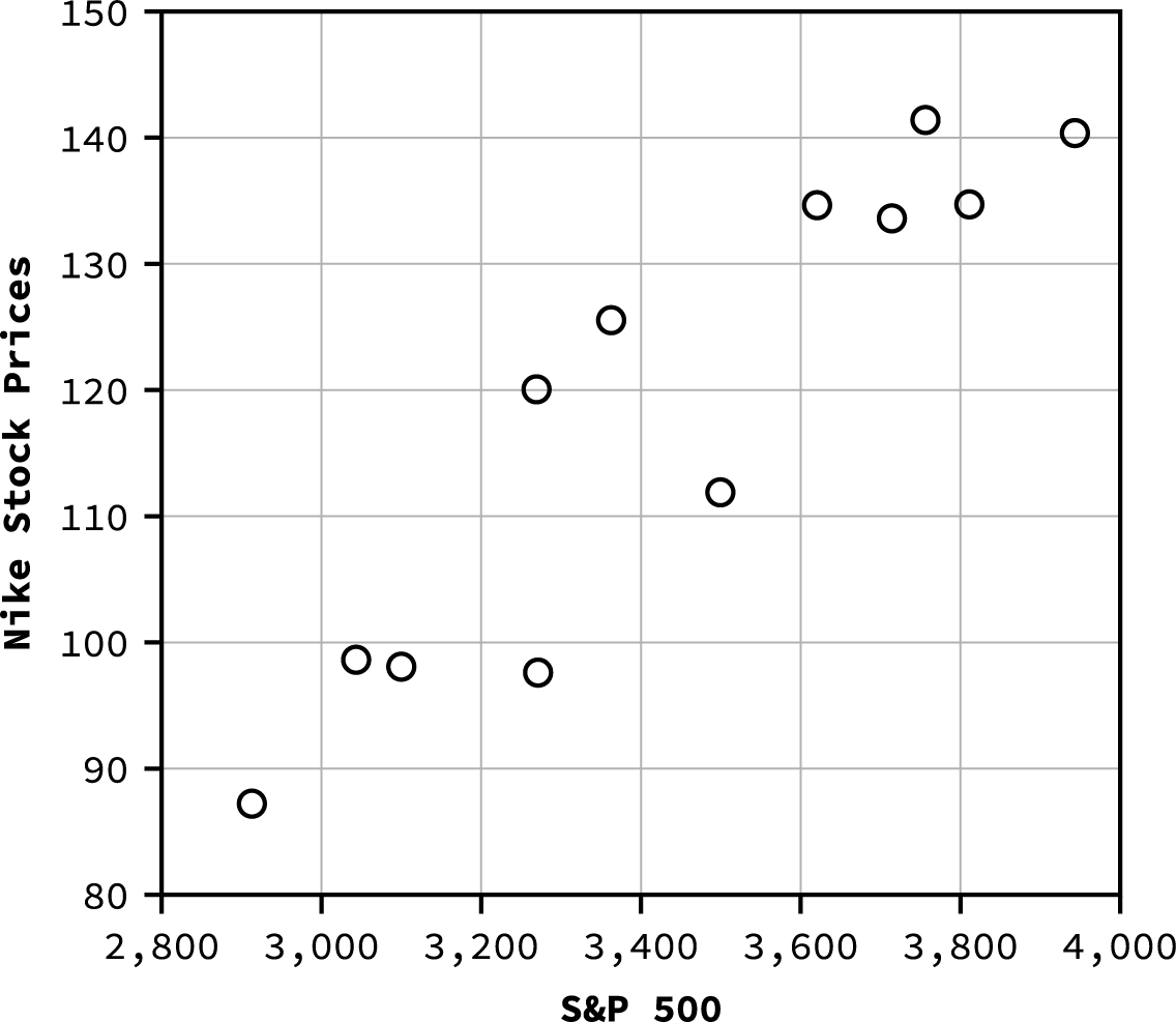
Figure 13.10 Scatter Plot Generated by R for Nike Stock Price versus S&P 500
 Summary
Measures of Center
Several measurements are used to provide the average of a data set, including mean, median, and mode. The terms mean and average are often used interchangeably. To calculate the mean for a set of numbers, add the numbers together and then divide the sum by the number of data values. The geometric mean redistributes not the sum of the values but the product by multiplying all of the individual values and then redistributing them in equal portions such that the total product remains the same. To calculate the median for a set of numbers, order the data from smallest to largest and identify the middle data value in the ordered data set.
Measures of Spread
The standard deviation and variance are measures of the spread of a data set. The standard deviation is small when the data values are all concentrated close to the mean, exhibiting little variation or spread. The standard deviation is larger when the data values are more spread out from the mean, exhibiting more variation. The formula used to calculate the standard deviation depends on whether the data represents a sample or a population, as the formulas for the sample standard deviation and the population standard deviation are slightly different.
Measures of Position
Several measures are used to indicate the position of a data value in a data set. One measure of position is the z-score for a particular measurement. The z-score indicates how many standard deviations a particular measurement is above or below the mean. Other measures of position include quartiles and percentiles.
Quartiles are special percentiles. The first quartile, Q1, is the same as the 25th percentile, and the third quartile, Q3, is the same as the 75th percentile. The median, M, is called both the second quartile and the 50th percentile. To calculate quartiles and percentiles, the data must be ordered from smallest to largest. Quartiles divide ordered data into quarters. Percentiles divide ordered data into hundredths.
Statistical Distributions

A frequency distribution provides a method of organizing and summarizing a data set and allows us to organize and tabulate the data in a summarized way. Once a frequency distribution is generated, it can be used to create graphs to help facilitate an interpretation of the data set. The normal distribution has two parameters, or numerical descriptive measures: the mean, , and the standard deviation, . The exponential distribution is often concerned with the amount of time until some specific event occurs.
Probability Distributions
A probability distribution is a mathematical function that assigns probabilities to various outcomes. In many financial situations, we are interested in determining the expected value of the return on a particular investment or the expected return on a portfolio of multiple investments. When analyzing distributions that follow a normal distribution, probabilities can be calculated by finding the area under the graph of the normal curve.
Data Visualization and Graphical Displays
Data visualization refers to the use of graphical displays to summarize a data set to help to interpret patterns and trends in the data. Univariate data refers to observations recorded for a single characteristic or attribute, such as salaries or blood pressure measurements. When graphing univariate data, we can choose from among several types of graphs. The type of graph to be used for a certain data set will depend on the nature of the data and the purpose of the graph. Examples of graphs for univariate data include line graphs, bar graphs, and histograms. Bivariate data refers to paired data where each value of one variable is paired with a value of a second variable. Examples of graphs for bivariate data include time series graphs and scatter plots.
The R Statistical Analysis Tool
R is an open-source statistical analysis tool that is widely used in the finance industry. It provides an integrated suite of functions for data analysis, graphing, and statistical programming. R is increasingly being used as a data analysis and statistical tool as it is an open-source language, and additional features are constantly being added by the user community. This tool can be used on many different computing platforms and can be downloaded at The R Project for Statistical Computing (https://openstax.org/r/The-R-Project).
 Key Terms
arithmetic mean a measure of center of a data set, calculated by adding up the data values and dividing the sum by the number of data values
bar graph a chart that presents categorical data in a summarized form based on frequency or relative frequency
bivariate data paired data in which each value of one variable is paired with a value of a second variable
data visualization the use of graphical displays, such as bar charts, histograms, and scatter plots, to help interpret patterns and trends in a data set
empirical rule a rule that provides the percentages of data values falling within one, two, and three standard deviations from the mean for a bell-shaped (normal) distribution
expected value a weighted average of the values of a variable where the weights are the associated probabilities
exponential distribution a continuous probability distribution that is useful for calculating probabilities within the time between events
frequency distribution a method of organizing and summarizing a data set that provides the frequency with which each value in the data set occurs
geometric mean a measure of center of a data set, calculated by multiplying the data values and then raising the product to the exponent, where n is the number of data values
histogram a graphical display of continuous data showing class intervals on the horizontal axis and frequency or relative frequency on the vertical axis
interquartile range (IQR) a number that indicates the spread of the middle half, or middle 50%, of the data; the difference between the third quartile (Q3) and the first quartile (Q1)
median the middle value in an ordered data set
mode the most frequently occurring data value in a data set
normal distribution a bell-shaped distribution curve that is used to model many measurements, including IQ scores, salaries, heights, weights, blood pressures, etc.
outliers data values that are significantly different from the other data values in a data set
percentiles numbers that divide an ordered data set into hundredths; often used to indicate position of a data value in a data set
population data data representing all the outcomes or measurements that are of interest
portfolio a collection of financial investments, such as stocks, bonds, mutual funds, certificates of deposit, etc.
probability distribution a mathematical function that assigns probabilities to various outcomes
quartiles numbers that divide an ordered data set into quarters; the second quartile is the same as the median
sample data data representing outcomes or measurements collected from a subset or part of a population
scatter plot (or scatter diagram) a graphical display that shows the relationship between a dependent variable and an independent variable
standard deviation a measure of the spread of a data set that indicates how far a typical data value is from the mean
time series graph a graphical display used to show measurement data plotted versus time, where time is
displayed on the horizontal axis
variance the measure of the spread of data values calculated as the square of the standard deviation weighted mean a measure of center of a data set in which each data value has a corresponding weighting x-axis the horizontal axis in a rectangular coordinate system
y-axis the vertical axis in a rectangular coordinate system
z-score (or z-value) a measure of the position of a data value in the data set, calculated by subtracting the mean from the data value and then dividing the difference by the standard deviation